

You’ve created an amazing new product—maybe it’s low-carb, high in protein, or packed with unique minerals. Naturally, you want to highlight these benefits on your packaging. But before you sell in Canada, it’s essential to understand the regulations set by the Canadian Food Inspection Agency (CFIA).
Read More
Does Sustainable Packaging Truly Drive Sales, or Is It Just a Marketing Gimmick?
Sustainable packaging has become a buzzword in today’s consumer-driven market, capturing the attention of brands and consumers alike. With growing environmental concerns and rising demand for eco-conscious products, many companies are jumping on the sustainability bandwagon, investing in innovative, greener packaging solutions.
But does sustainable packaging truly drive sales, or is it just a marketing tactic to appeal to environmentally conscious shoppers?
Read More
2025: The Year of… Brown?!
Every year, Pantone announces its “Color of the Year,” setting the tone (quite literally) for design, fashion, and branding trends across industries. This annual ritual isn’t just about picking a pretty hue—it’s about capturing the spirit of the times and inspiring creative expression across the globe. For 2025, Pantone has chosen Mocha Mousse—a warm, earthy brown that many might not expect to lead the charge. And, well… I have some thoughts.
Read More
The Secret Power of Colour: Why That Red Button Makes You Click
Ever walked into a store and felt strangely drawn to a particular aisle, inexplicably compelled to pick up a certain product? Or maybe you've scrolled through endless online listings, only to find yourself clicking "add to cart" on something that wasn't even on your initial shopping list? It might sound like magic, but there's a powerful force at play here – the psychology of colour.
Sure, you might think you're making decisions based on logic and need. But the truth is, colour plays a surprisingly significant role in influencing our perception and ultimately, our purchasing decisions. From the vibrant hues adorning store shelves to the carefully chosen tones on a website's layout, colour is a silent salesman whispering sweet nothings (or maybe urgent calls to action!) into your subconscious.
Don't believe it? Here's why colour is more than just a pretty face in the world of consumer behaviour.
Read More
The Power of Quiet Contemplation: A Surprising Self-Discovery
Recently, I embarked on a self-discovery journey inspired by David C. Baker's advice. I sought the insights of trusted friends to uncover my unique ability. The responses were illuminating, revealing a hidden strength that had long been overlooked.
A recurring theme emerged: thoughtful contemplation.
Read More
A Visual Exploration of Memorable Coffee Packaging
As a designer, I'm constantly drawn to the artistry and innovation found in packaging design. It's more than just a protective layer; it's a silent salesperson, a first impression, and often, a memorable experience. Today, I want to delve into a specific example that caught my eye – a product that, quite literally, had me double-taking.
Read More
A Journey to 50: Lessons Learned and Muscles Gained
As I reflect on the past year, it's clear that life has been a series of small tweaks, setbacks, and new learnings. These incremental adjustments, often overlooked, have had a profound impact on my overall well-being.
One area where I've focused on making small tweaks is my physical health. It's easy to get caught up in grand fitness goals, but I've found that consistent, small changes yield remarkable results.
I've always been active, but this year, I decided to take a more structured approach to my fitness routine and I embarked on a strength training journey.
Read More
A Deep Dive into Wine Packaging
In recent years, the wine industry has faced a unique challenge. While the quality of Canadian wines has soared to new heights, the packaging often falls short. As a result, many younger consumers are turning away from wine, opting for more visually appealing and innovative beverage choices.
Read More
Stock photo by Vecteezy
Let's Talk Powers
I wanna talk powers, but sadly there are no superheroes here.
...Hamilton Helmer's book "7 Powers" refers to the seven key strategies or business models that companies can leverage to achieve and sustain a competitive advantage (spoiler: #5 is my fave).
It provides real-world examples grounded in decades of experience as a strategy advisor, active equity investor, and Stanford University professor that help us build a set of mental models to think through strategy.

Weaving My Way to Creativity
So, here's a little secret about me: I'm not exactly a natural-born artist. I've tried my hand at painting, sketching, and even pottery, but let's just say I'm more of a "creative thinker" than a "creative maker."
But then, this past winter, something unexpected happened. I decided to give weaving a shot.
Now, I know what you're thinking: "Weaving? That's a bit old-fashioned, isn't it?" Well, maybe. But hear me out.
Read More
Is There a Packaging Redesign Opportunity in the Tropical Juice Aisle?
Walking down the tropical juice aisle, do you notice something? The packaging of these products seems remarkably similar. Three brands, all using a logo enclosed in a circle, highly saturated colours, and large-scale, realistic fruit photography. It makes me wonder — is there an opportunity here for a packaging redesign?
Don’t get me wrong, I appreciate the consistent use of vibrant colours and mouth-watering fruit images, but with so many similarities, none of the brands truly stand out. They tend to blur together on the shelf, making it challenging for a consumer to pick one brand over the others.
Read More
Not all labels are created equal! BOPP versus paper labels
Before you send that label to print - dyk not all labels are created equal?!
A common mistake made in the early days of a new food business is to choose paper labels as a way of cutting costs or in order to choose a more sustainable option.
BUT if your food contains oils or water you can run the risk of the ink spreading.

A love of the printed page
On behalf of all designers, I'd like to make a confession:
We still love paper.
From my quarterly subscription to Issues Magazine Shop to drooling over Standards Manual's publications to my sample paper pack from Spicers Canada, I still can't get enough of it.

Photo credit: Thumpr455 on Flickr
Appreciating a Great Logo: Bold, Memorable, and Full of Personality
Have you ever stopped to truly appreciate a great logo? I mean, really just take a moment to think about what makes a logo stand out. Let’s break it down!
Read More
Getting selected to curate an online Canadian Art Site
It was about a year ago when Partial Gallery approached me with an exciting opportunity. They wanted me to curate a selection of original Canadian art for their website. As someone passionate about art and design, I was thrilled to take on this project. The idea of showcasing Canadian talent and sharing unique pieces with a broader audience was right up my alley.
When I started thinking about which pieces to select, I knew I wanted to focus on something that felt both meaningful and visually striking.
Read More
Stock photo by Vecteezy
Customer is always FIRST
You've heard it before, but it bears repeating: The customer comes first. Always. A common question in branding and marketing webinars is: "How do I market my coffee, winery, baked goods, or fresh-pressed juices?" While it's a great question, if there was one clear answer, wouldn't every brand in these categories be doing the same thing and looking the same to consumers?
Read MoreI've been selected!
I’ll admit it: I still need external validation from time to time. 🙋🏽♀️ So when I was asked to design the Association of Registered Graphic Designers (RGD) 2025 certification sticker, both my imposter syndrome and total elation were manifested simultaneously 😂 But srsly I’m so thrilled to have been asked and I can’t wait to focus on design of an entirely different nature. And as Meghan D'Mello, RGD pointed out to me, as designers we just 💖stickers! https://rgd.ca/articles/amanda-devries-rgd-selected-to-design-rgd-membership-sticker-for-2025

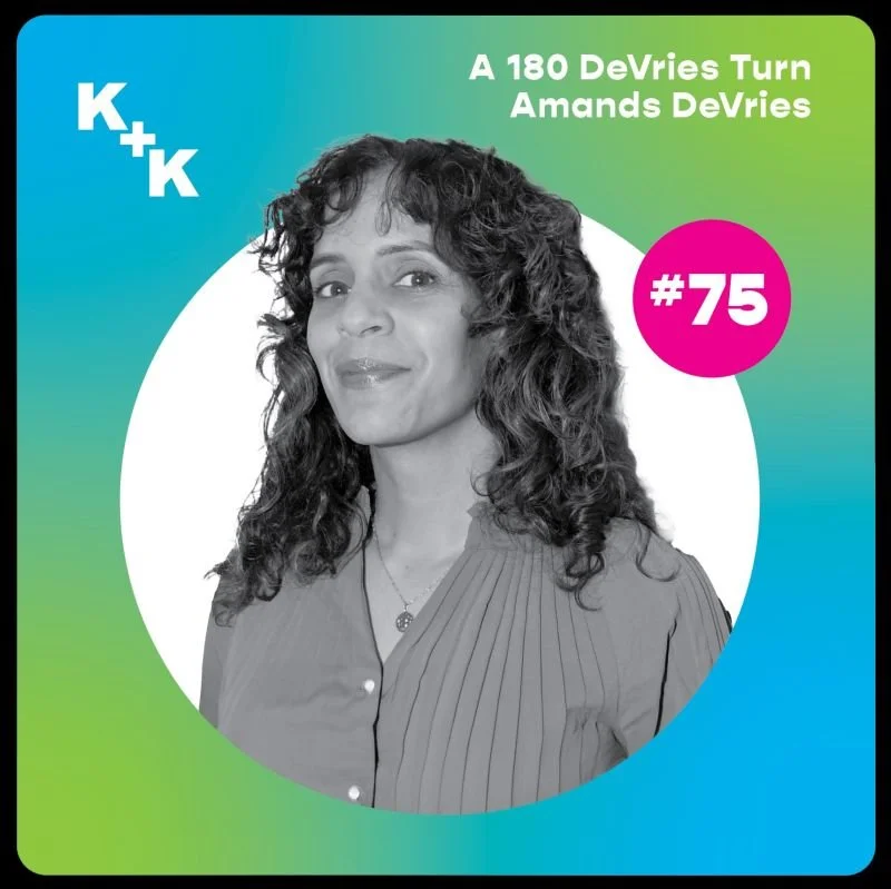
A 180 DeVries Turn: Amanda DeVries on the Kirk + Kurtts Podcast
In April 2024 Amanda got a chance to sit down with Kirk Visola and Andy Kurtts on their packaging design podcast.
If you want to hear the whole story of how she got to where she is today, give it a listen!
Retail Roundup
During a recent retail excursion, I stumbled upon some packaging that caught my eye. What struck me was how these brands fully embraced their culture without hesitation. There was no trying to be trendy or playing it safe – just a genuine embrace of their unique aesthetic.
As a consumer, this kind of authenticity speaks volumes. In a busy grocery store, where I'm rushing to check off items from my list, I appreciate when a brand's packaging instantly tells me whether it's for me or not.
Read More
Le Graphisme chez Deberny et Peignot
A small work break a few weeks back included watching “Le Graphisme chez Deberny et Peignot” .
This was a talk hosted by The Cooper Union for the Advancement of Science and Art and presented by Amelia Hugill-Fontanel presented live this week.
This presentation offered a fascinating glimpse into the world of typography.
What caught my attention was the array of type specimens showcased during the talk. Each typeface had a story to tell, and delving into the history behind them was truly captivating. From classic serif fonts to modern sans-serifs, the diversity of designs showcased the evolution of typography over time.
Read More