
The Eye Candy Design Process
At Eye Candy Design, we don’t just make things look good—we make them work. And as a very small studio, you get direct access to a seasoned creative director who understands your vision and goals.
We have two areas where we particularly shine:
Vintage Inspiration, Modern Impact
– A touch of nostalgia meets contemporary design, creating packaging that feels both timeless and fresh.Elevating Ethnic Food Brands
– We specialize in bringing cultural food products into the mainstream with premium, standout packaging.
Every project starts out with an excavation of what the brand/package needs to do *in the real world*.
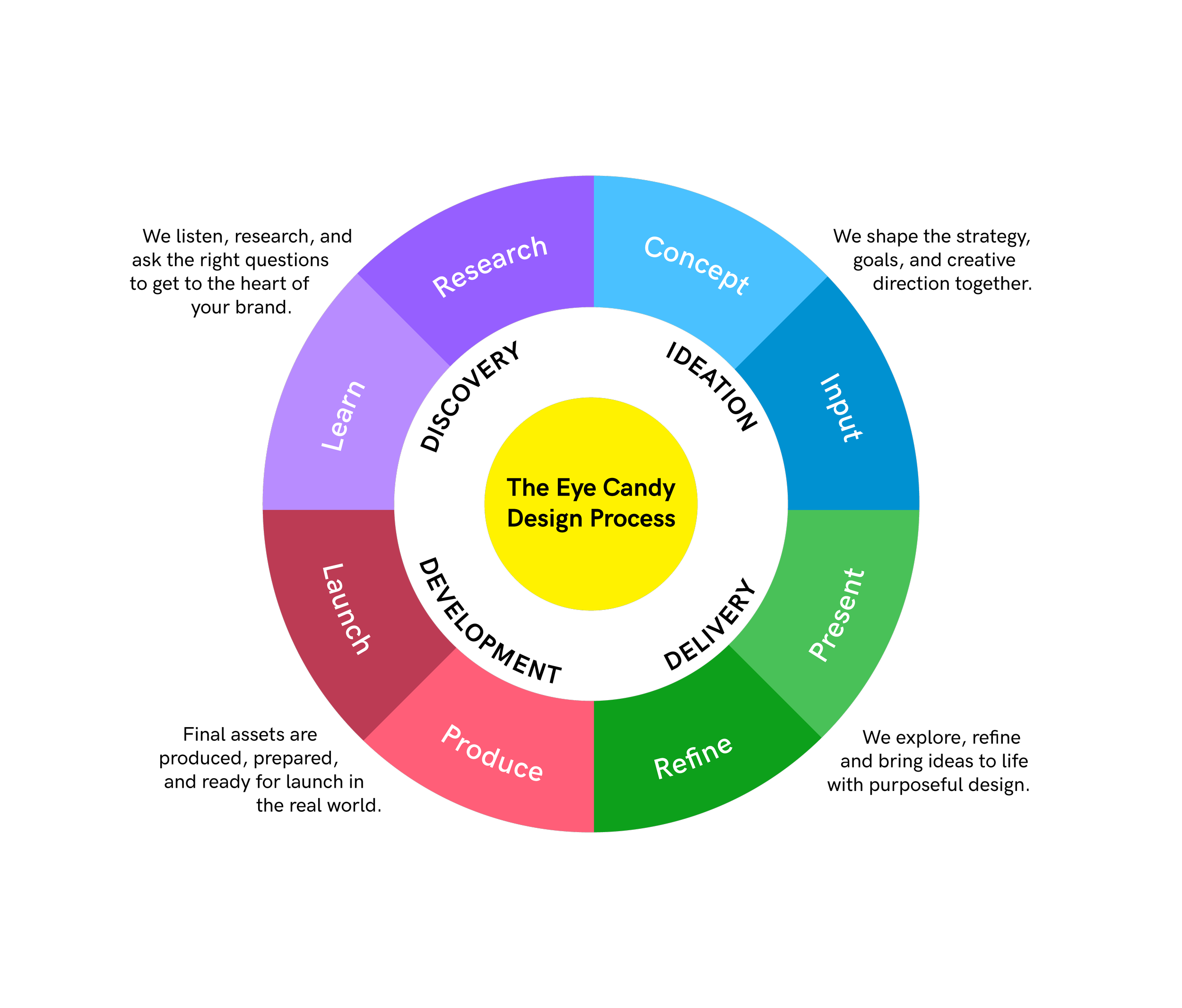
HOW WE WORK:
-
We start with conversation based on how you fill out our questionnaire. Questions include:
<img src=https://images.squarespace-cdn.com/content/5eb2f006a2ec0157b608c462/b977772f-956e-4499-8c6d-9142161ad84e/process%2Bpage%2Bgif+%281%29.gif?format=500w>
-
IF YOU ARE A NEW BRAND: In the case of a new brand, this involves surveying the “white space” of the category we are focussed on and how to exploit that to our advantage. What are people buying today because your product doesn’t yet exist?
<img src=https://images.squarespace-cdn.com/content/5eb2f006a2ec0157b608c462/1d1b7d73-1631-4c57-a0bf-2343a31d8a0c/Competitive+Analysis+Process+Page.jpg?content-type=image%2Fjpeg>
IF YOU ARE REBRANDING: In the case of a rebrand, this involves a careful study of what makes the brand unique and special already in the minds of the consumer. Then we execute by retaining the parts of the brand that we want to preserve, while letting go of the aspects that are stagnating in the marketplace.
<img src=https://images.squarespace-cdn.com/content/5eb2f006a2ec0157b608c462/f1155f21-1599-495b-b035-37b1b9588ccb/Rebrand+Process+Page.jpg?content-type=image%2Fjpeg>
-
This is where the work really starts. Fonts, colors and art must come together to tell a complete story.
Typography
Fonts is a HUGE part of our exploration. So much can be said using a specific font. That’s why Kashi is rounded and soft; while Tesla is technical and chiseled.
<img src=https://images.squarespace-cdn.com/content/5eb2f006a2ec0157b608c462/3c14086e-b3e8-4630-a920-644c4aa68563/KEPT+Fonts.gif?content-type=image%2Fgif?format=400w>
Graphics
Graphics are next. If graphics are important to convey the right message, can we abstract them in order to simplify, make it more memorable, and most importantly, create an emotional connection? At this point we will explore textures, illustrations, & stock graphics to hit the right balance of emotional appeal and messaging.
Color:
It’s know that red increases appetite while green is soothing and has associations with nature. But color psychology in food packaging goes way beyond that: how do we strike the balance of conveying nostalgia while communicating the right message? The answer can lie in the right tone set by the color palette.
-
We always refer back to your documents to ensure that the emotions we are creating align with the messaging that is right for your business. But sometimes, clients give us more than one message that they feel is priority. So we create multiple concepts, each putting emphasis on one message more than the other. We can take the time to really make a decision around what’s most important for the brand.
-
We present these concepts to you and go through the steps to decide together what message is the most important and therefore, which concept will lead next steps.
<img src=https://images.squarespace-cdn.com/content/5eb2f006a2ec0157b608c462/fca144d2-4aa5-482d-8601-4932908d4d83/Branding+Concept+Presentation.jpg?content-type=image%2Fjpeg>
-
We then refine, add color into the exploration, and then finalize the result!
<img src=https://images.squarespace-cdn.com/content/5eb2f006a2ec0157b608c462/454b2dfb-3ca7-4976-9660-765cda9bf1e5/Refinements+to+Branding+Design+Process.jpg?content-type=image%2Fjpeg>
-
Next steps are creating all the assets you need.
* If this is a branding project, you will get files like fonts/images/style guide/plus a tutorial on how to use them.
<img src=https://images.squarespace-cdn.com/content/5eb2f006a2ec0157b608c462/d8f57c18-0f60-4d7c-aa63-e0a3f5d089f2/Asset+Delivery+-+Branding+-+Process+Page.png?content-type=image%2Fpng>
* If it's a packaging project, we will provide print-ready files according to your printer's specfications via a Google Drive or Dropbox link. We also work with your printer to review proofs and confirm color values.
<img src=https://images.squarespace-cdn.com/content/5eb2f006a2ec0157b608c462/dea93515-2882-49ed-845d-eba09c98a75b/Asset+Delivery+-+Packaging-+Process+Page.png?content-type=image%2Fpng>
-
Then we get to sit back and enjoy the fruits of our collaboration, by seeing all that work in the final product!
<img src=https://images.squarespace-cdn.com/content/5eb2f006a2ec0157b608c462/8a26b0ba-ee0c-4998-9441-ca8b7d2509a2/Products.gif>
-
We stay in touch to support implementation and growth of your brand!