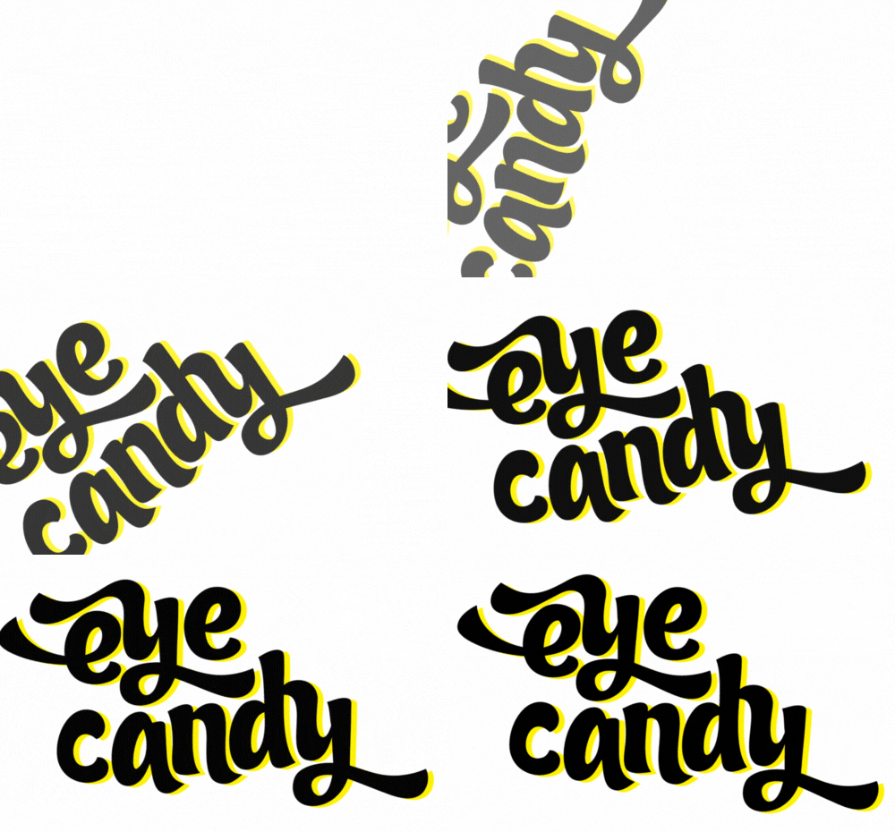

It was about a year ago when Partial Gallery approached me with an exciting opportunity. They wanted me to curate a selection of original Canadian art for their website. As someone passionate about art and design, I was thrilled to take on this project. The idea of showcasing Canadian talent and sharing unique pieces with a broader audience was right up my alley.
When I started thinking about which pieces to select, I knew I wanted to focus on something that felt both meaningful and visually striking. After considering various themes, I decided to curate a series that leverages typography. Typography has always fascinated me because it combines visual art with language, creating a powerful way to convey messages and evoke emotions. It’s not just about letters and words; it’s about how they’re presented and the impact they have.
So, I dove into the world of Canadian art, looking for pieces where typography played a central role. I was looking for works that didn't just use text as an element but used it as the primary means of communication. It was important to find art that blended form and function, where the words themselves were beautiful and meaningful.
The process was both challenging and rewarding. I explored countless pieces, each with its own unique take on typography. Some used bold, graphic fonts that jumped off the canvas, while others employed more subtle, intricate designs that drew you in slowly. I found works that played with scale, color, and texture in fascinating ways. Each piece had its own story to tell, and the artists used typography to tell those stories in creative and compelling ways.
One of the highlights of this project was discovering the incredible talent of Canadian artists. There’s so much creativity and innovation in the Canadian art scene, and it was an honor to shine a light on some of these amazing works. From established artists to emerging talents, the variety and depth of the art I encountered were truly inspiring.
As I curated the collection, I kept the audience in mind. I wanted to select pieces that would resonate with a wide range of people, whether they were art enthusiasts or casual viewers. The goal was to create a collection that was accessible yet thought-provoking, with each piece offering something different to discover.
In the end, I put together a series of works that I believe capture the essence of what makes typography such a compelling art form. These pieces don’t just communicate through words; they create an experience that goes beyond language. They invite viewers to look closer, to appreciate the nuances of design and the power of text.
Curating this collection for Partial Gallery was a fantastic experience. It allowed me to connect with the art community, support Canadian artists, and share beautiful, meaningful works with a larger audience. If you haven’t checked it out yet, I highly recommend taking a look. Whether you’re a fan of typography or just appreciate good art, I think you’ll find something that speaks to you.
So, a year later, I look back on this project with pride and satisfaction. It was a journey of discovery and creativity, and I’m grateful for the opportunity to share these incredible pieces with the world. Here's to more art, more creativity, and more opportunities to connect through the power of design.
ICYMI: https://www.partial.gallery/collection/the-meaning-is-in-the-words-by-amanda-devries