
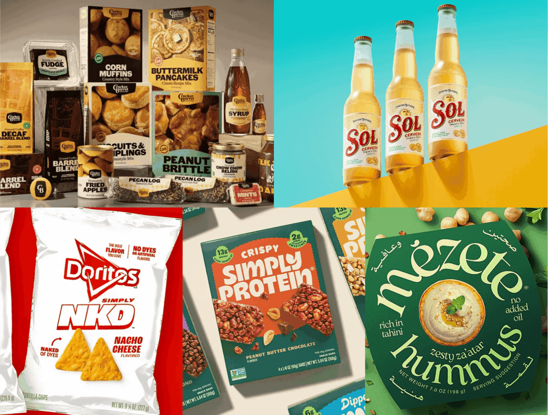
This article was originally published on RGD.
I don’t know how you feel, but, for me, 2025 was a doozy for design.
Even with AI dominating the conversation, designers around the world delivered standout projects that reaffirmed both the power of human creativity and the ever-present need to put consumers first.
Below are a few of the projects that caught my eye this year—not just because they were visually compelling, but because they each reveal something important about where branding and packaging seem to be headed.
Cracking the barrel
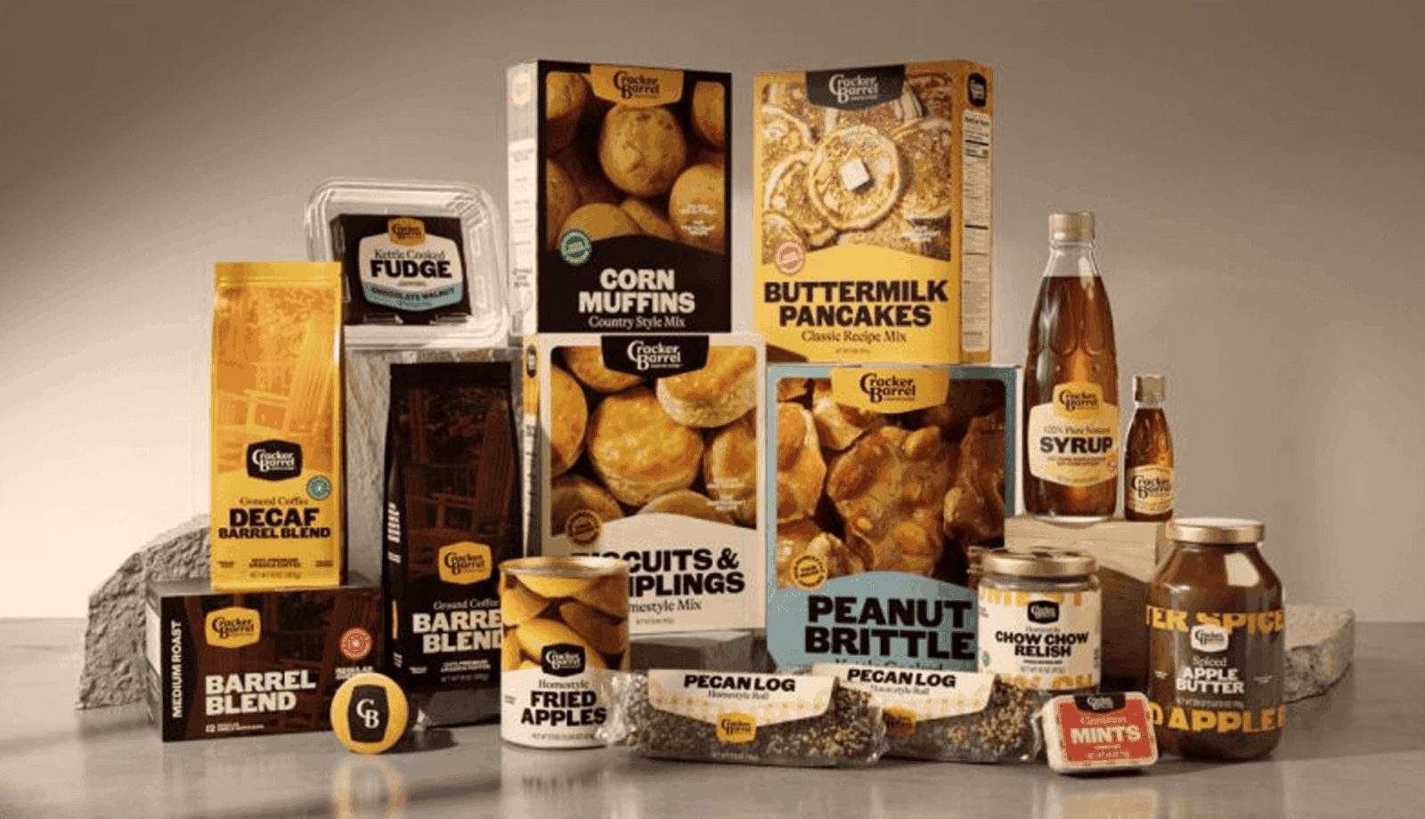
To me, what makes this story most significant was the fact that a rebranding discussion entered the public consciousness. Normally these kinds of debates are held in closed design circles, but this was so newsworthy that I could even get a take from friends and family!
Source: Packaging Digest
However, you felt about the rebranding itself, it should be noted that the updated packaging was a winner. The product line oozes Americana heritage but feels relevant thanks to the subdued colour palette and strong typographic system. The execution was nearly perfect—and I hope the team that worked on it can still feel good about it, despite the controversy that ensued!
Looking to the future by acknowledging the past
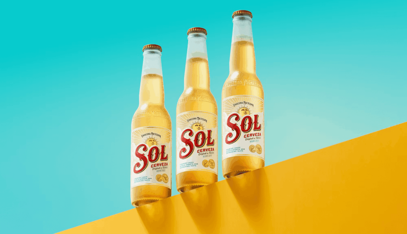
A slightly more successful refresh can be found in the beer category. Mexican lager brand Sol took a wide-lens look at its identity and delivered a rebrand that feels as though it’s always looked this way, while still feeling contemporary and new.
Source: Creative Review
The sun takes centre stage in the logo (arguably where it always belonged), while a typography-first approach and cheerful colour palette create a brand that feels approachable, optimistic and refreshing. It’s a thoughtful example of heritage-led evolution done right.
Stripping back
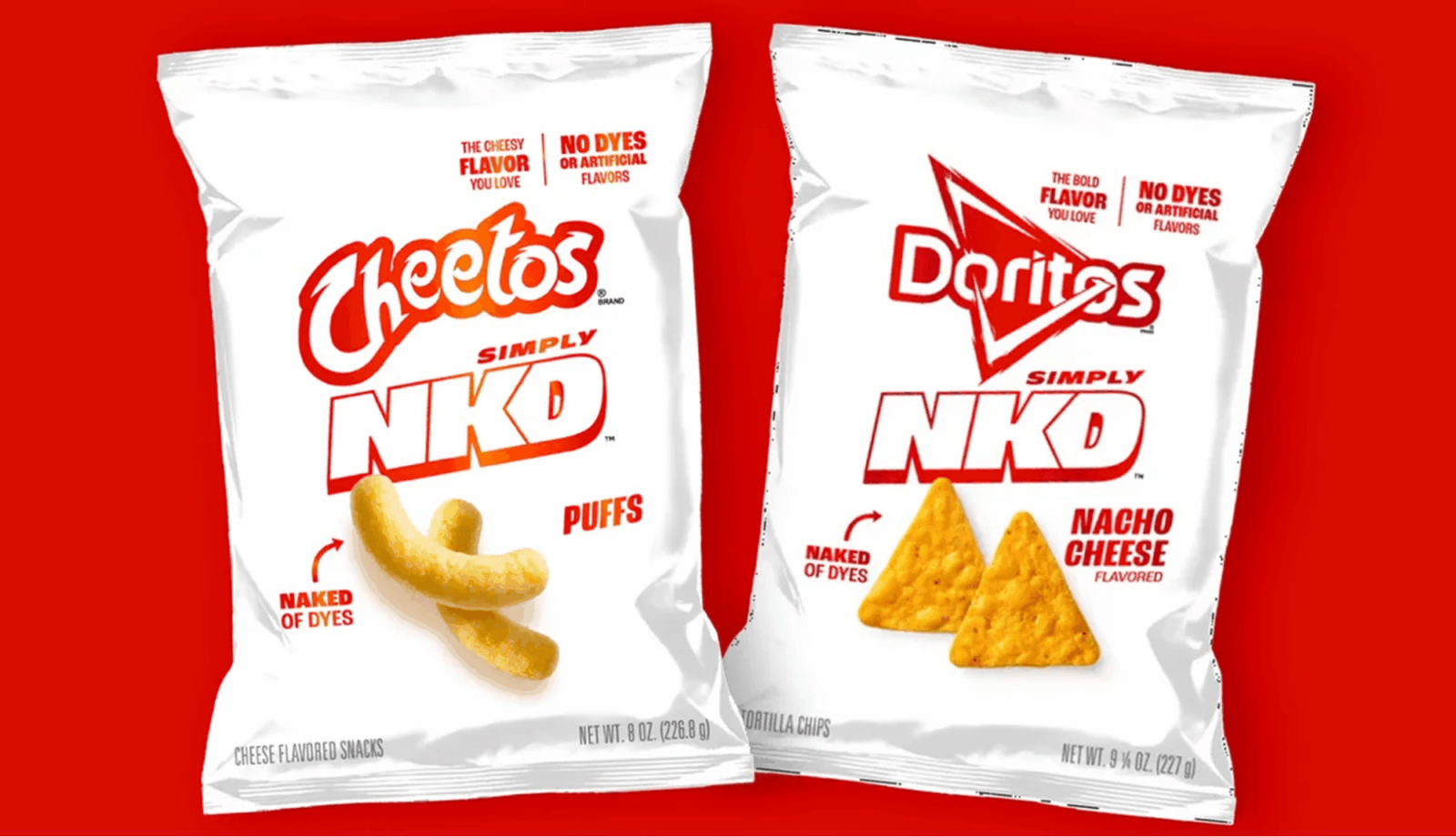
The chip aisle is crowded, noisy and bright and most products have a similar story to tell. As a consumer, you can wander this aisle for hours and witness a sea of bold colours and graphics that shout.
But when Doritos read the room and decided to launch a line of Cheetos that are free from additives, dyes and artificial flavours, they did so in a very unexpected way.
The “barely there” packaging tells the story right away: a clean, white background, single colour approach is a genius way to demonstrate their commitment to the health-conscious crowd (at least for this product line, anyway). This look signals purity, restraint and wellness without ever saying the words.
In a category defined by shouting, whispering can speak volumes!
Canadian protein shows its humanity
Although I’m not a big energy bar consumer myself, I’ve studied this category extensively in a professional context. Simply Protein’s former black-and-white packaging lacked the warmth consumers often look for when seeking health-focused options.
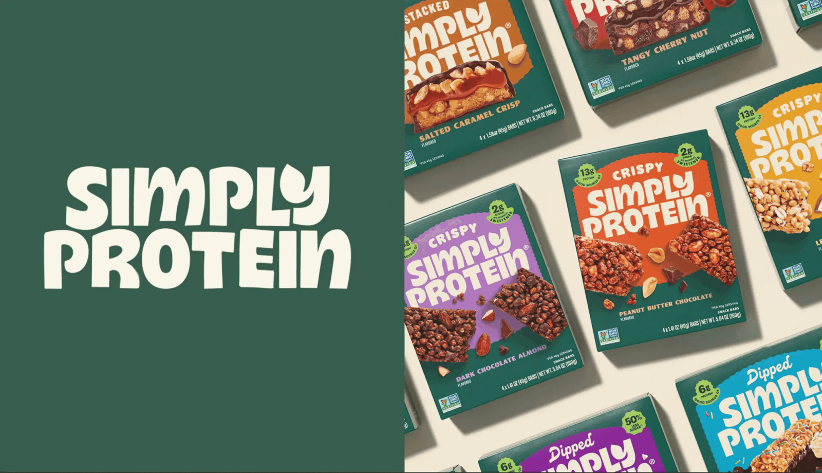
Source: The Dieline
Enter 2025, which saw Simply Protein emerge into its authentic era! The bars now look delicious, approachable and full of real ingredients customers actually want to eat. The warm colours and strong brand architecture also allowed it to launch new products that feel well-aligned to the brand.
In short: the products now look delicious and craveable and this shift toward appetite appeal is not just cosmetic, it’s essential!
A stunning refresh for Jordanian food brand
I first saw this brand at a food trade show earlier this year, and immediately the vibrancy of the colours and typography stopped me in my tracks. There’s just enough hint of the richness of the culture to make me feel as if I’m being transported to the streets of Amman, without slipping into cliché. And yet, the clear visual hierarchy and saturated colours make the products easy to identify and recall in a North American grocery store. This look and feel is a perfect example of a highly ownable brand look that delivers the right information to consumers in the right way.
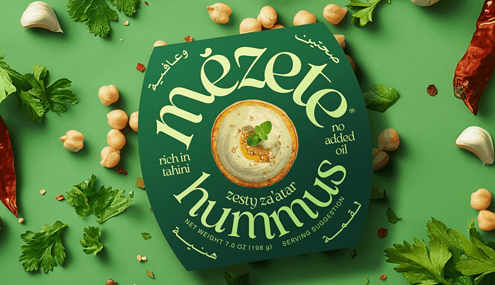
Source: Packaging of the World
Of course, this list barely scratches the surface. 2025 was filled with remarkable brand stories, refreshes and bold experiments that stretched the boundaries of what packaging can do. If there’s a project you think deserves a spotlight, I’d love to hear about it.
Design might be evolving faster than ever, but as these examples show, the heart of the discipline remains the same: clarity, humanity and a deep respect for the people we’re designing for.