
When Rajesh launched his family's authentic Indian pickle brand in Toronto, he was confused by the feedback. His mango pickle, a staple in Indian households with a moderate, tangy heat, was being returned as "dangerously spicy" by Canadian retailers. Meanwhile, his vindaloo paste, traditionally one of the hottest curries in Indian cuisine, was praised as "pleasantly spicy" by the same buyers.
The product hadn't changed. The cultural translation had failed.
This is the invisible barrier that stops thousands of heritage food brands from breaking into mainstream North American retail. It's not about changing your recipe or diluting your authenticity, it's about creating a visual and verbal language that guides unfamiliar consumers through their first experience with your product.
The Cultural Translation Gap: Why Direct Translation Fails
If you're bringing a food product from your heritage culture to North American shelves, you've likely encountered this frustrating reality: the words on your label aren't doing what you think they're doing.
The "Medium Spicy" Trap
Consider these real examples:
Sichuan chili oil labeled "medium heat" that brings Western consumers to tears
Caribbean hot sauce marked "extra hot" that Thai food lovers find mild
Mexican chipotle salsa called "smoky and mild" that sends unprepared shoppers running
The problem isn't your product. It's that spice perception is entirely cultural, and your packaging needs to bridge that gap before someone takes their first bite.
A 2023 study by the Food Marketing Institute found that 67% of North American consumers abandon ethnic food purchases after one negative "surprise" experience—whether that surprise is unexpected heat, unfamiliar texture, or confusing flavour profiles.
What Design Does That Words Can't
Here's where most heritage food brands get it wrong: they think translation is about finding the right English words. But design translates before language does.
Your packaging makes promises before someone reads a single word:
1. Colour Communicates Heat Levels
Western consumers have been conditioned by decades of packaging to associate certain colours with heat intensity:
Green/yellow = mild, fresh, herbal
Orange/red = medium heat, approachable
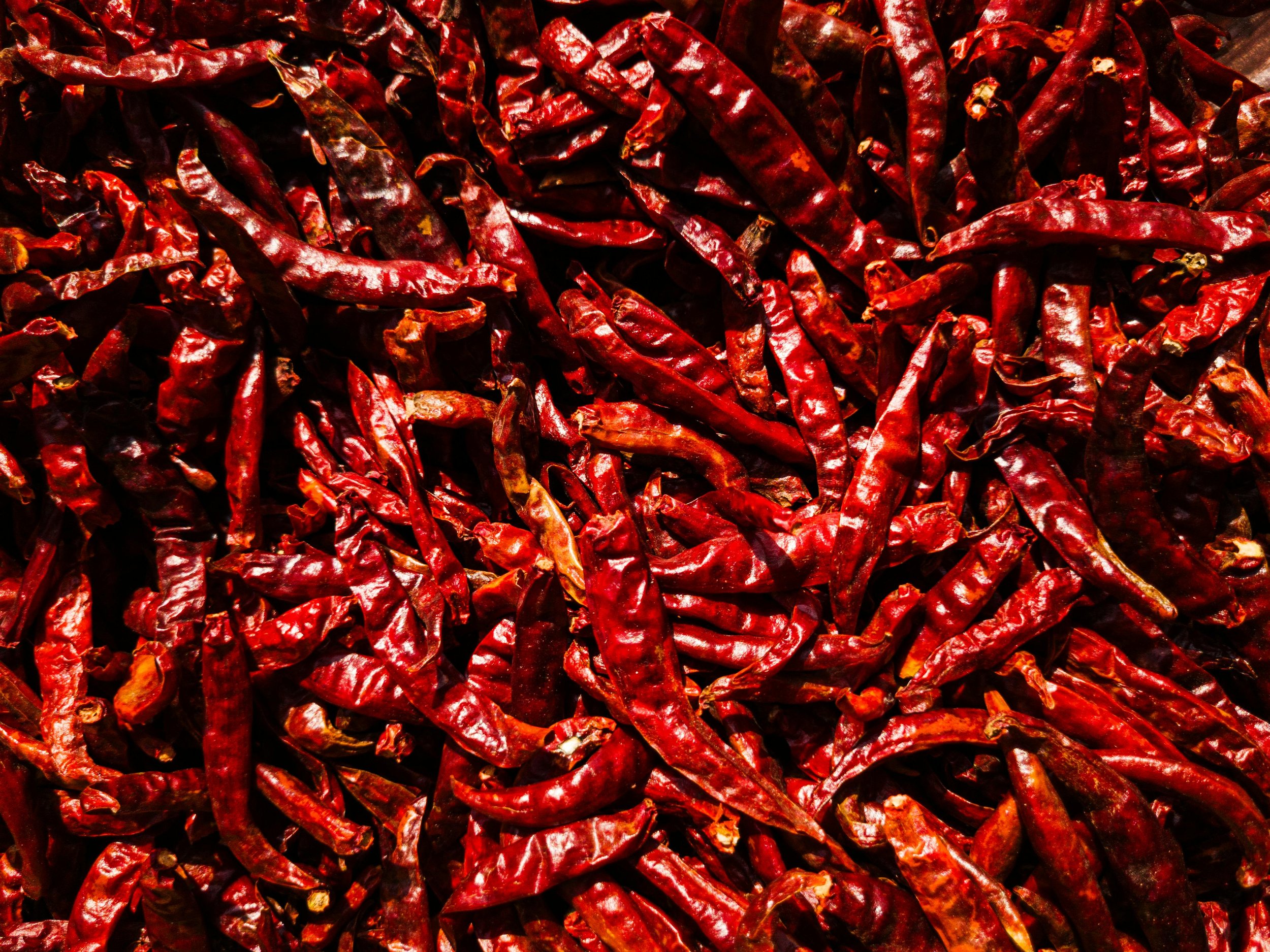
Deep red/black = serious heat, proceed with caution
Purple/earth tones = complex, sophisticated (not necessarily spicy)
When your authentic Thai green curry paste comes in bright green packaging, North American consumers expect something fresh and mild, not the intense, complex heat they're about to encounter. Your colour choices set expectations that override your written descriptions.
Real-World Example: Repositioning Heat Through Colour
One of our clients was struggling with returns when they came to us. Their packaging featured bold reds and blacks with flame graphics, visual cues that screamed "extreme heat" to Western buyers. The reality? Their blend was aromatic and savoury with moderate warmth, similar to a BBQ rub.
We repositioned the packaging with warm terracotta, sunset oranges, and illustrations of savoury grilled foods. . The design translated the true experience before consumers even opened the jar.
2. Typography Sets Texture Expectations
The fonts you choose subconsciously tell consumers about your product's texture and mouthfeel:
Smooth, flowing scripts = creamy, smooth, mild
Bold, geometric sans-serifs = crunchy, structured, confident
Hand-drawn, rustic fonts = chunky, homestyle, traditional
Elegant serifs = refined, complex, premium
If your coconut curry sauce is thick and chunky but your label uses flowing script fonts, you're creating cognitive dissonance. Consumers feel betrayed when the experience doesn't match the visual promise.
3. Imagery Provides Context and Permission
One of the biggest barriers for heritage foods is the "intimidation factor." North American consumers don't buy products they don't know how to use.
Strategic imagery on your packaging serves as a visual permission slip:
Show the finished dish, not just the ingredient
Include familiar foods alongside traditional preparations
Demonstrate serving suggestions through lifestyle imagery
Bridge cultural gaps by showing your product in recognizable contexts
The Five-Step Cultural Translation Framework for Packaging Design
After working with ethnic and heritage food brands over years, we've developed a framework that maintains authenticity while making products accessible:
Step 1:
Identify the Cultural Disconnect Points
Before you design anything, map out where cultural misunderstanding is most likely to occur:
Heat/spice levels (most common)
Texture expectations (creamy vs. chunky, smooth vs. grainy)
Flavour intensity (mild vs. bold, subtle vs. assertive)
Unfamiliar ingredients (need context and education)
Traditional use cases (how, when, and with what to use your product)
Action Step: Survey 10 people outside your cultural background. Show them your product and ask what they expect based on appearance alone. The gaps between their expectations and reality are your translation opportunities.
Step 2: Create a Visual Spice Scale That Resonates
Stop using generic "mild, medium, hot" labels. Create a visual heat scale that:
Incorporates cultural context: "Traditional Sichuan heat" + comparison to Western benchmark
Employs visual icons: Pepper icons, flame symbols, or culturally relevant graphics
Provides specific applications: "Bold enough for marinades, gentle enough for eggs"
Step 3: Design a "Translation Layer" Into Your Packaging
This is separate from your ingredient list and nutritional panel. It's a dedicated space that:
Explains unfamiliar ingredients in relatable terms
Provides authentic and adapted serving suggestions
Shares cultural context without being preachy
Offers flavour bridges: "If you like ___, you'll love ___"
Example Translation Layer:
For a Korean Gochugaru (chili flakes):
Instead of: "Traditional Korean red pepper flakes"
Try: "Korean Gochugaru: Sun-dried red chili flakes with a subtle sweetness and moderate heat. Think smoky paprika meets crushed red pepper. Essential for kimchi, but also incredible on popcorn, roasted vegetables, or to rim your margarita glass."
Step 4: Colour-Code Your Product Line Strategically
If you have multiple products or heat levels, create a consistent colour system that respects both cultural authenticity and Western consumer education:
Use culturally significant colours as your base (stay authentic)
Layer in heat-level indicators using recognizable Western colour cues
Maintain family resemblance across your product line
Ensure shelf-blocking creates a visual story
Real Example: A client with a line of Thai curry pastes used traditional Thai gold as the unifying element, then differentiated heat levels through secondary colours: green packaging for mild green curry, warming oranges for medium panang curry, and deep reds for hot red curry. The colour system worked cross-culturally.
“REAL EXAMPLE: A client with a line of Thai curry pastes used traditional Thai gold as the unifying element, then differentiated heat levels through secondary colours: green packaging for mild green curry, warming oranges for medium panang curry, and deep reds for hot red curry. The colour system worked cross-culturally.”
Step 5: Test With Your Target Market (Not Your Community)
Here's the hard truth: your cultural community already understands your product. They're not your primary growth opportunity in North American retail.
Test your packaging with:
People unfamiliar with your cuisine
Mainstream grocery shoppers aged 25-60
Food-curious consumers who buy ethnic foods occasionally
Natural food store customers (your gateway to mainstream)
Testing Questions:
What do you think this product will taste like?
How spicy do you think this is on a scale of ketchup to hot sauce?
What would you make with this?
Would you buy this? Why or why not?
What's confusing or concerning about this package?
Flavour Expectation Anchoring: The Secret Weapon
One of the most powerful tools in cultural translation is anchoring unfamiliar flavours to familiar experiences.
The Anchoring Formula:
[Your Traditional Food] is like [Familiar Food] meets [Unexpected Element]
Examples:
"Harissa is like smoky paprika meets roasted red pepper with a kick"
"Gochujang is like sweet BBQ sauce meets sriracha"
"Tamarind chutney is like apple cider vinegar meets dried apricots"
"Miso is like soy sauce meets peanut butter complexity"
This formula: ✓ Provides instant comprehension ✓ Reduces fear of the unknown ✓ Creates positive associations with familiar favourites ✓ Doesn't dilute your authentic positioning
Where to use it:
Front of package subheadlines
Website descriptions
Retailer pitch sheets
Social media content
Sampling event signage
Source: Amerıca’s test kıtchen
The Premium Positioning Advantage for Heritage Brands
Here's an opportunity most ethnic food brands miss: there's enormous appetite for authentic, premium cultural foods in North America.
Consumers are willing to pay premium prices for:
Authentic, traditional ingredients
Heritage recipes with stories
Artisanal production methods
Cultural education and experience
But they'll only pay premium prices for premium-looking packaging.
Elevating Heritage Aesthetics
Your packaging doesn't need to look "Western"—it needs to look intentional, confident, and premium.
Don't:
Use clip art or generic stock imagery
Overcrowd your label with text
Rely on dated design tropes from your country of origin
Apologize for or over-explain your authenticity
Do:
Invest in custom illustrations that honour heritage motifs
Use clean, modern typography alongside traditional elements
Create generous white space (it signals premium quality)
Tell your story confidently without being defensive
Before & After: West African Hot Sauce
Before: Crowded label, multiple fonts, literal flame graphics, all-caps text screaming "EXTREMELY HOT," busy tribal patterns, low-resolution pepper photos
After: Single hero pepper illustration in bold, graphic style; clean modern font; traditional textile pattern as subtle background texture; heat level indicated by sophisticated icon system; story told in calm, confident voice: "Three generations of heat perfection"
Impact: Moved from ethnic aisle to premium condiment section; 3x price point; featured in specialty food retailers.
Common Cultural Translation Mistakes to Avoid
Mistake #1: The Authenticity Paradox
The trap: Trying to prove how "authentic" and "traditional" you are by making your packaging look like it was designed 50 years ago in your country of origin.
The reality: North American consumers equate outdated design with outdated (unsafe) food production methods.
The fix: Honour tradition through modern interpretation, traditional patterns rendered in contemporary styles, heritage colours in updated palettes, cultural stories told through contemporary photography.
Mistake #2: The Over-Translation
The trap: Removing all cultural markers and making your product look completely generic to fit in.
The reality: You lose your unique selling proposition. Why would someone buy your "ethnic" product if there's nothing ethnic about it anymore?
The fix: Maintain strong cultural identity while adding accessibility cues. Think "Cultural ambassador," not "cultural camouflage."
Mistake #3: The Assumption That Ethnic = Cheap
The trap: Pricing your products low and using budget packaging because that's what other ethnic brands do.
The reality: You're reinforcing stereotypes and leaving money on the table. Premium ethnic foods are a $47 billion market in North America.
The fix: Position for premium when your quality deserves it. Invest in packaging that commands premium pricing.
Mistake #4: The Defensive Positioning
The trap: Adding disclaimers like "Don't worry, it's not too spicy!" or "Not as weird as you think!"
The reality: You're putting doubt in consumers' minds before they even try your product.
The fix: Confident, positive positioning: "Bold flavours for adventurous palates" or "The perfect introduction to Sichuan cuisine."
Bilingual Labelling: Navigating Canadian Requirements
If you're selling in Canada, bilingual labelling isn't optional, it's law. But it's also an opportunity for cultural translation.
Strategic Bilingual Design:
Use both languages to tell your story: Use French and English to reach broader consumer segments
Consider Quebec market differences: French Canadian consumers often have different heat tolerances and flavour preferences than English Canadian consumers
Make compliance beautiful: Bilingual labels don't need to look cluttered, they can be a design feature
Leverage the Montreal test market: Quebec consumers are often more adventurous with ethnic foods, use this for test launches
Pro Tip: Work with a packaging designer who understands CFIA (Canadian Food Inspection Agency) requirements from day one. Retrofitting compliance into finished designs is expensive and time-consuming.
The ROI of Cultural Translation Design
Let's talk numbers. Investing in proper cultural translation through strategic packaging design typically returns:
30-60% increase in trial purchases (consumers willing to try)
40-80% increase in repeat purchases (product matched expectations)
2-4x premium price point (vs. basic ethnic aisle competitors)
85% reduction in returns (from expectation mismatches)
3-6 month payback period on design investment
One of our clients recouped their design investment for their ethnic product within three months of sales, directly due to packaging that clearly communicated quality and use cases to North American consumers
Making It Real: Your Action Plan
Ready to bridge the cultural translation gap for your heritage food brand? Here's your roadmap:
Research & Strategy
Conduct informal consumer testing with target market
Map cultural disconnect points
Develop your flavour anchoring statements
Create your visual heat/flavour scale
Audit competitor positioning in your category
Design Development
Engage a designer experienced in ethnic food brands
Develop colour strategy that works cross-culturally
Create translation layer content
Design with Canadian bilingual requirements (if applicable)
Develop visual brand system across product line
Testing & Refinement
Test designs with target consumers
Refine based on feedback
Finalize production files
Begin production
Plan launch strategy
From Ethnic Aisle to Every Aisle
The goal of cultural translation isn't to make your heritage food brand less authentic, it's to make your authentic product accessible to consumers who don't share your cultural background.
Your grandmother's recipe deserves to be discovered. Your traditional ingredients deserve premium positioning. Your cultural food heritage deserves to move beyond the "ethnic aisle" ghetto and find its place throughout the store, in the premium condiment section, in the organic aisle, in the meal solutions area.
Great packaging design is your cultural ambassador, it invites unfamiliar consumers into your culinary world while honouring the traditions that make your product special.
The North American market is hungry for authentic cultural foods. They just need someone to help them navigate the first bite.
Ready to Translate Your Heritage Brand for North American Success?
At Eye Candy Design, we specialize in helping ethnic and heritage food brands bridge cultural gaps without compromising authenticity. With over 19 years of experience in the industry, we understand the unique challenges you face.
We're rewriting the "exotic" narrative, creating packaging that guides consumers confidently to your product, because ethnic foods should feel at home in any aisle.
Book a free brand audit to discuss your cultural translation needs and discover how strategic packaging design can unlock your retail potential.
Keywords: ethnic food packaging, heritage food branding, cultural translation design, North American food retail, ethnic food brand strategy, spice level communication, cultural food marketing, ethnic food labelling, authentic food branding, mainstream retail strategy