
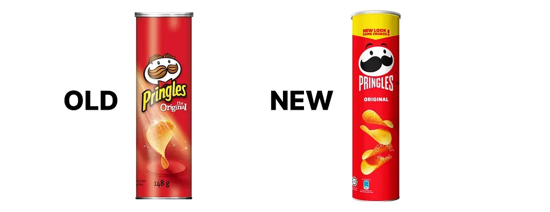
If you're the person responsible for a brand that's been on shelf for two decades, you already know the real risk of a rebrand isn't that the new design will look bad. It's that it will look fine; clean, modern, on-trend, and quietly cost you the shoppers who've been picking your product off the same shelf spot for years without even reading the label.
That's not a hypothetical. It's exactly what happened to one of the most recognizable orange juice brands in North America, and it's the case study every brand director should understand before approving a single mood board.
The $30 Million Lesson Nobody Wanted to Learn
In 2009, Tropicana replaced its packaging, the familiar orange with a straw stuck in it, a bold horizontal logo, decades of shelf equity, with a minimalist redesign built around a plain glass of juice and a thin, vertical wordmark. On paper, it was a legitimate modernization. The design team wasn't incompetent; they were chasing exactly the kind of clean, premium aesthetic that wins design awards.
Consumers didn't recognize it. Regular buyers walked past their own juice in the store because the visual cues their eyes had learned to scan for (the orange, the straw, the horizontal red logo) were simply gone. Sales dropped an estimated 20% in about two months, and the company reversed course and brought back the original design not long after. Marketing professor Mark Ritson later summarized it bluntly: the redesign achieved something Tropicana's competitors hadn't managed in twenty years — it degraded the brand's own equity.
The lesson isn't "never change." Tropicana still sells juice today, obviously. The lesson is more specific, and more useful: a brand's most valuable assets are often invisible to the people managing it. When you've stared at your own logo, colours, and pack shape every day for years, they stop feeling special. To a shopper who glances at a shelf for 2-3 seconds while making a decision, those same elements are the entire mechanism by which they find you. Strip them out, and you haven't modernized your brand — you've launched a new one, minus the awareness and loyalty you spent twenty years building.
Why "We Tested It and People Liked It" Isn't Enough
Here's the part that should genuinely worry established brand teams: Tropicana almost certainly did consumer research before launching. The failure wasn't a lack of testing, it was testing the wrong thing.
Showing someone a new design in isolation and asking "do you like this?" measures preference. It does not measure recognition, and recognition is what actually drives repeat purchase behaviour at the shelf. Most grocery shopping happens on a kind of autopilot, consumers aren't evaluating design quality in the aisle, they're pattern-matching against a mental image built from hundreds of prior purchases. A design can score well in a conference room and still fail in a store, because a conference room doesn't test speed-of-recognition under real shopping conditions, surrounded by competitors, with three seconds to decide.
If you're planning a rebrand, the research question isn't "do people like the new look?" It's "how quickly and accurately can our existing customers find this on a shelf they've never seen it on before?" Those are very different tests, and only one of them would have caught Tropicana's problem before it cost $30 million.
Evolutionary vs. Revolutionary: Choosing the Right Kind of Change
Not every rebrand needs to be cautious, and not every legacy brand should play it safe. The brands that get this right tend to fall cleanly into one of two categories, and the mistake is picking the wrong one for your situation.
Evolutionary rebrands preserve the core recognition assets such as the colour, the mark, the silhouette while refining execution, typography, and supporting details. Dunkin's 2019 shift from "Dunkin' Donuts" to simply "Dunkin'" is the textbook example: the name changed, the product focus shifted toward beverages, but the pink-and-orange palette and the rounded, friendly typography stayed almost entirely intact. Customers didn't have to relearn anything. The change communicated growth, not disruption.
Revolutionary rebrands intentionally break from the past because the past is the problem. Old Spice's 2010 repositioning didn't preserve much of its old identity. It couldn't, because "your grandfather's cologne" was the exact perception it needed to escape. The gamble paid off: body wash sales grew 107% within a month, largely because the campaign was smart enough to target the actual purchase decision-maker (research showed women were buying most of the body wash) rather than just the end user.
The deciding question is simple: Is your current brand equity an asset or a liability? If customers still associate you with something positive, quality, trust, a specific product experience, you're almost always in evolutionary territory, even if the visual execution feels dated. If your current brand is actively working against you, signalling "irrelevant," "outdated," or worse, a more dramatic break may be justified. Most established food and beverage brands, even ones that feel tired internally, are sitting on more goodwill than they realize. That goodwill is exactly what an evolutionary approach is designed to protect.
A Practical Framework Before You Touch Anything
Before any design work starts, a rebrand for an established brand should go through a structured audit, not a creative exercise, a genuinely analytical one.
1. Map your distinctive assets, separately from your liked assets. Distinctive assets are the specific visual elements that let a customer identify you without reading the name, a colour, a shape, an icon, a typographic quirk. Liked assets are things people find pleasant but that don't actually drive recognition. The distinction matters enormously: you can freely modernize liked assets, but distinctive assets are the ones that require Tropicana-level caution. Most brand teams have never separated these two categories, which is precisely how recognition assets get discarded by accident.
2. Interview the people who didn't design the current brand. Internal teams overvalue novelty and undervalue familiarity, because they're bored of their own brand long before customers are. Balance internal instinct with input from retail buyers, frontline sales, and critically actual repeat customers who can tell you what they're actually looking for on the shelf, not what they'd say they want in an abstract survey.
3. Test recognition under realistic conditions, not preference in a vacuum. Mock up the new design on an actual shelf set, next to actual competitors, and measure how fast people find it, ideally against a control group shown the current design. A redesign that "tests well" in isolation but slows down shelf recognition is a redesign that will cost you sales, no matter how much everyone in the room likes it.
4. Decide what you're solving for before you decide what it should look like. Are you refreshing tired execution? Repositioning for a new demographic? Signalling a category shift, the way Dunkin' did? Correcting a genuine liability, the way Old Spice did? Each of these calls for a different intensity of change, and skipping this step is how brands end up making revolutionary changes to solve evolutionary problems, which is exactly what happened at Tropicana.
5. Build the communication plan alongside the design, not after it. Part of what made the Tropicana reversal so costly is that the change arrived with no explanation, customers were simply confronted with an unfamiliar box. A rebrand that comes with clear, proactive communication about why something is changing gives loyal customers a bridge to the new identity instead of a jump scare.
What This Looks Like in Practice
When we take on a rebrand for an established brand, the first conversation isn't about colour palettes or typography, it's a careful audit of what's already working, whether the team managing the brand realizes it or not. That's a fundamentally different starting point than a brand-new product launch, where the job is building recognition from zero. With an established brand, the job is protecting recognition that already exists while giving it room to grow, and that requires treating existing equity as a strategic asset to be mapped and preserved, not an aesthetic constraint to be overcome.
A 20-year-old brand has something a new brand can only dream of: a customer base that already trusts it enough to buy it on autopilot. The goal of a rebrand should never be to interrupt that autopilot. It should be to make sure that when customers glance at the shelf, they still find you instantly, just looking a little sharper than they remembered.
We've built our process specifically around de-risking the decision for established food and beverage brands, if your brand is facing a rebrand and you want a second opinion on what to protect and what to evolve contact us.