
When a beloved local business is ready to grow beyond its hometown roots, the stakes are high. The brand identity that served them well in their intimate tea shop needs to support broader ambitions—strengthening their e-commerce presence and opening doors to retail opportunities. This was the challenge facing Blue Mountain Tea Co., a premium tea purveyor nestled in the scenic community of Collingwood, Ontario.
The result? A sophisticated rebrand and packaging system that not only elevated the brand but earned recognition with a prestigious Canadian Printing Award. Here's the story of how strategic design thinking and meticulous execution transformed a local tea shop into a professional brand ready for its next chapter of growth.
Understanding the Challenge: Growth Without Losing Authenticity
Blue Mountain Tea Co. had cultivated something special. Their cozy shop in Collingwood had become a destination for both year-round residents and the steady stream of vacationers drawn to the area's natural beauty. The in-store experience was thriving, with customers connecting to the brand's warm, approachable personality and, of course, the exceptional quality of the tea itself.
But the owner had bigger aspirations. She wanted to grow her business—bolstering the e-commerce platform and eventually getting into select retail stores. There was just one problem: the existing brand identity, while charming and familiar to loyal customers, wasn't polished enough to support these expansion goals.
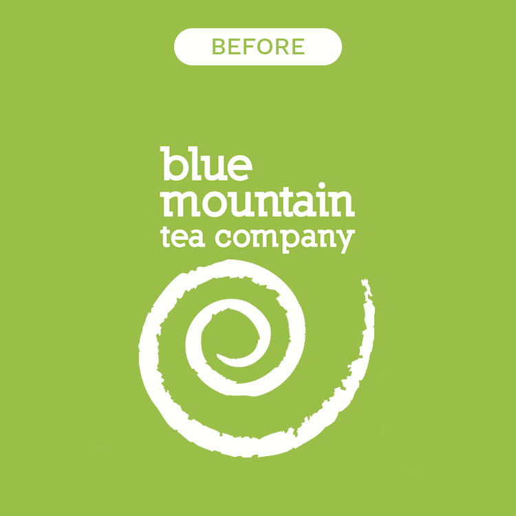
The visual identity featured a signature swirl that had become synonymous with the brand. The owner was emotionally attached to this element, and rightfully so—it represented years of building customer relationships and brand equity. Our challenge was to honour this connection to the brand's heritage while creating something that could compete in the increasingly sophisticated specialty tea market.
The question before us was clear: How do you evolve a brand to meet professional retail standards without losing the authenticity that made it beloved in the first place?
Strategic Design Thinking: Form Follows Function
Every successful rebrand begins with strategy, not aesthetics. Before we considered colour palettes or typography, we needed to understand the business objectives and consumer behavior in the specialty tea category.
Our research revealed several critical insights. First, the specialty tea market is crowded and competitive. For Blue Mountain Tea Co. to eventually succeed in retail environments, the packaging would need to work harder—communicating quality, differentiation, and brand personality in the split second a consumer's eye sweeps across a shelf.
Second, we identified a common pain point in tea shopping: the confusion between caffeinated and caffeine-free options. Many consumers shop for tea with a specific need in mind—perhaps they want an energizing morning blend or a calming evening herbal tisane. Time spent squinting at labels and reading fine print translates to friction in the buying journey and, potentially, lost sales.
This insight became the foundation of our design strategy. Rather than relying solely on aesthetic appeal, we would build a system that actively aided the shopping experience through intuitive visual communication.
The Colour Solution: Blue for Energy, Green for Calm

The most impactful decision in the rebrand was the implementation of a dual primary colour palette. We designated blue to identify all caffeinated teas and green for non-caffeinated herbal blends and tisanes.
This wasn't an arbitrary choice. Colour psychology played a crucial role in the selection. Blue naturally evokes feelings of alertness, clarity, and energy—perfect associations for a morning black tea or an afternoon oolong. Green, conversely, connects to nature, wellness, and tranquility—ideal for herbal infusions designed for relaxation and evening enjoyment.
But beyond the psychological associations, this colour-coding system solved a practical problem. A customer browsing the tea aisle, whether online or in-store, could instantly identify the right product category for their needs. Reaching for blue? You're getting caffeine. Selecting green? You're choosing a caffeine-free option. This seemingly simple distinction dramatically improved the user experience and reduced the cognitive load required to make a purchase decision.
The system also provided structural flexibility. As Blue Mountain Tea Co. expands its product line—introducing new flavours, seasonal offerings, or limited editions—the colour framework ensures consistency and immediate recognition, regardless of the specific blend.
Preserving Heritage While Pushing Forward
The signature swirl that the owner cherished wasn't discarded—it was refined and elevated. We stylized the icon, giving it cleaner lines and more sophisticated proportions while maintaining its essential character. This evolution honored the brand's history while signaling a new level of professionalism.
The swirl became a versatile brand element, functioning as both a primary mark and a supporting pattern. Its organic, flowing nature reinforced the natural, premium positioning of the teas while adding visual interest to the packaging. This careful balance between familiar and fresh was crucial to maintaining loyalty among existing customers while appealing to new audiences.
Typography and layout also received thoughtful consideration. We selected fonts that conveyed sophistication without stiffness—approachable yet refined. The hierarchy on each package was carefully structured to guide the eye: brand name, tea variety, and the colour-coded system all working in concert to communicate clearly and beautifully.
Packaging Innovation: The Tea Sampler Story

While the primary packaging system formed the backbone of the rebrand, we also developed something special: a distinct packaging concept for a tea sampler. This product served a specific purpose in the brand strategy—allowing customers to explore multiple varieties and serving as an ideal gift item or entry point for new customers.
We partnered with Pique Packaging, a specialist in premium packaging solutions, to bring this concept to life. The sampler needed to feel special, to convey the experience of discovery and the quality of the teas within. Every detail mattered, from the structural design to the finishing touches.
The execution was impeccable. The sampler packaging became a showcase of printing craftsmanship—precisely the type of work that catches the attention of industry awards juries. The attention to detail, the quality of materials, and the innovative structural design all contributed to a package that elevated the unboxing experience and reinforced Blue Mountain Tea Co.'s premium positioning.
The Perfect Execution: Why Details Matter
Winning a Canadian Printing Award isn't just about having a beautiful design concept—it's about flawless execution. Every aspect of the packaging production required precision and expertise.
The colour reproduction needed to be consistent across different package sizes and formats. The blues and greens that formed the foundation of the system had to be spot-on, batch after batch, to maintain the integrity of the colour-coding strategy. Any variation would undermine the functionality of the system.
The material selection supported the brand's premium positioning while remaining practical for retail distribution and e-commerce shipping. The substrate needed to protect the tea from light and moisture while feeling substantial in the hand—signaling quality from the moment a customer picked up the package.
Finishing techniques added layers of sophistication. Whether through spot varnishes, special coatings, or embossing details, these touches transformed the packaging from merely functional to genuinely special. These are the details that create emotional connections with consumers and justify premium pricing.
The partnership with Pique Packaging was instrumental in achieving this level of execution. Their expertise in specialty packaging ensured that the design vision translated perfectly to physical reality. They understood that we weren't just creating a container for tea—we were creating a brand experience.
Real Results: When Design Meets Business Objectives
The true measure of any rebrand is its impact on business performance. In this case, the results validated every strategic decision.
Consumer response was immediate and overwhelmingly positive. Existing customers found the new look "fresh" and "stylish" while still recognizing the brand they loved. This continuity was crucial—rebrands can alienate loyal customers if not handled carefully, but the preservation of key brand elements like the swirl maintained that essential connection.
New customers responded enthusiastically to the professional, polished appearance. The brand now held its own against established competitors on retail shelves. The colour-coding system worked exactly as intended, with customers reporting that it made their shopping experience easier and faster.
Perhaps most importantly, the owner herself gained confidence in her expansion plans. She now had a brand identity that aligned with her broader business goals—one that could support her e-commerce growth and make her competitive when approaching retail partners. The foundation was solid, professional, and scalable.
The brand now sells through their Collingwood tea shop, online, and has begun appearing in a few small specialty stores. The professional packaging has opened doors to conversations with potential retail partners, with the strong visual identity and clear product differentiation making a positive impression. The e-commerce platform has seen growth, with the intuitive packaging system translating effectively to digital product photography and online shopping.
Beyond the qualitative wins, the rebrand delivered quantifiable business results that validated the investment. Katherine Maxwell, owner of Blue Mountain Tea Company, shared impressive news about their new product launch: "...the new product we launched, which Eye Candy Design was instrumental in designing the packaging for, has recouped the total cost of the design investment in three months of sales. In my opinion, this is directly linked to the look and clever format of the packaging." This three-month ROI demonstrates what strategic design can achieve—not just a prettier package, but a genuine business asset that drives sales and pays for itself remarkably quickly.
Award Recognition: Industry Validation
The Canadian Printing Award represented industry validation of the project's excellence. These awards are highly competitive, judged by experts who evaluate technical execution, innovation, and overall impact. Winning in the packaging category demonstrated that the Blue Mountain Tea Co. rebrand achieved the highest standards of printing and production quality.
But beyond the prestige, the award serves a strategic business purpose. It provides third-party credibility that Blue Mountain Tea Co. can leverage as they approach retail partners and in their marketing communications. "Award-winning packaging" isn't just a nice phrase—it's a competitive differentiator that helps a smaller brand compete in a crowded marketplace.
The recognition also validated our approach to the rebrand. We didn't chase trends or create something that was merely pretty. Instead, we solved real business problems through thoughtful design strategy, and we executed that strategy with uncompromising attention to craft and quality.
Lessons for Growing Brands
The Blue Mountain Tea Co. rebrand offers valuable lessons for any business navigating the transition from local favorite to broader market presence.
First, growth requires evolution, but evolution doesn't mean abandonment. Honoring brand heritage while pushing forward creates continuity that maintains customer loyalty while attracting new audiences. The signature swirl could have been discarded in favor of something entirely new, but preserving and refining it was the smarter strategic choice.
Second, functional design solutions often create the most impactful aesthetics. The blue-and-green colour system wasn't just beautiful—it solved a real problem for consumers. This marriage of form and function created a system that worked both practically and emotionally.
Third, execution matters as much as concept. A brilliant design idea poorly executed will fail in the market. The partnership with skilled production partners like Pique Packaging ensured that the design vision became physical reality at the highest possible quality level.
Finally, strategic design investment pays dividends. The rebrand positioned Blue Mountain Tea Co. for sustainable growth, opening doors to new channels and customers while strengthening relationships with existing ones. The packaging didn't just contain tea—it communicated value, built brand equity, and drove business results.
Looking Forward: A Brand Positioned for Growth
Today, Blue Mountain Tea Co. stands at an exciting inflection point. The rebrand and packaging system have created a strong foundation for expansion while staying authentic to the brand's origins. The visual identity works seamlessly across touchpoints—from the cozy Collingwood shop to their online storefront to the small specialty stores now carrying their teas.
The award-winning packaging has opened conversations with potential retail partners who recognize the brand's quality and sophistication. While still primarily selling through their own tea shop and e-commerce platform, the professional packaging system positions them perfectly for broader retail opportunities when the time is right.
New product development has accelerated, with the flexible colour-coded system accommodating seasonal blends and special editions without requiring a complete redesign. The brand architecture supports future growth while maintaining consistency—exactly what a scaling business needs.
For Eye Candy Design, this project exemplifies our approach to branding and packaging: strategic thinking, creative problem-solving, and meticulous execution. We don't just make things look good—we build visual systems that position brands for growth and earn industry recognition.
The Blue Mountain Tea Co. transformation proves that with the right strategy and execution, a beloved local brand can create the professional foundation needed to pursue broader market opportunities without losing what made it special in the first place. It's a story of a brand now positioned for growth through design that's both beautiful and purposeful—a perfect blend, much like the teas themselves.
Interested in elevating your brand for growth? Whether you're expanding beyond your hometown or preparing for retail distribution, Eye Candy Design creates strategic visual identities that drive results. Let's talk about your brand's next chapter.