
Premium, Calming Tea Rebrand
Blue Mountain Tea company, based in Collingwood ON has a strong local following, attracting both residents and vacationers. While the in-store experience is thriving, the owner wants to grow—by bolstering her e-commerce platform and getting into select retail stores. Eye Candy Design developed a complete rebrand including logo refinement, strategic packaging design, marketing collateral, and a distinctive tea sampler concept—creating a polished, professional look that maintained the beloved signature swirl while positioning the brand for growth.
Beyond the qualitative wins, the rebrand delivered quantifiable business results that validated the investment. Katherine Maxwell, owner of Blue Mountain Tea Company, shared impressive news about their new product launch: "...the new product we launched, which Eye Candy Design was instrumental in designing the packaging for, has recouped the total cost of the design investment in three months of sales. In my opinion, this is directly linked to the look and clever format of the packaging." This three-month ROI demonstrates what strategic design can achieve—not just a prettier package, but a genuine business asset that drives sales and pays for itself remarkably quickly.
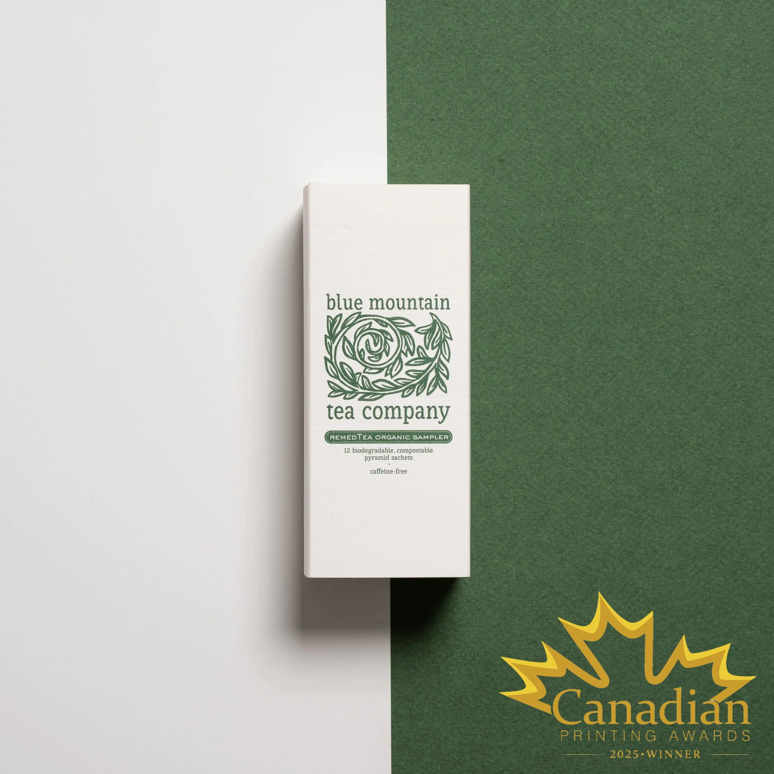
Work included an award-winning distinct packaging concept for a tea sampler perfectly executed by Pique Packaging.
CLIENT: BLUE MOUNTAIN TEA CO.
BRANDING
PACKAGING
MARKETING COLLATERAL

Before

After

The Challenge
From Local Success to Retail-Ready Brand
The premium loose leaf tea market demands sophisticated branding that communicates quality, freshness, and brand story while providing functional packaging solutions. Blue Mountain Tea Company's in-store success demonstrated strong product quality and customer loyalty, but expansion into e-commerce and retail required elevated visual identity.
Key challenges included:
Maintaining brand equity and the beloved signature swirl while modernizing the overall look
Creating instant product differentiation between caffeinated and non-caffeinated teas
Developing packaging that works across in-store, e-commerce, and retail environments
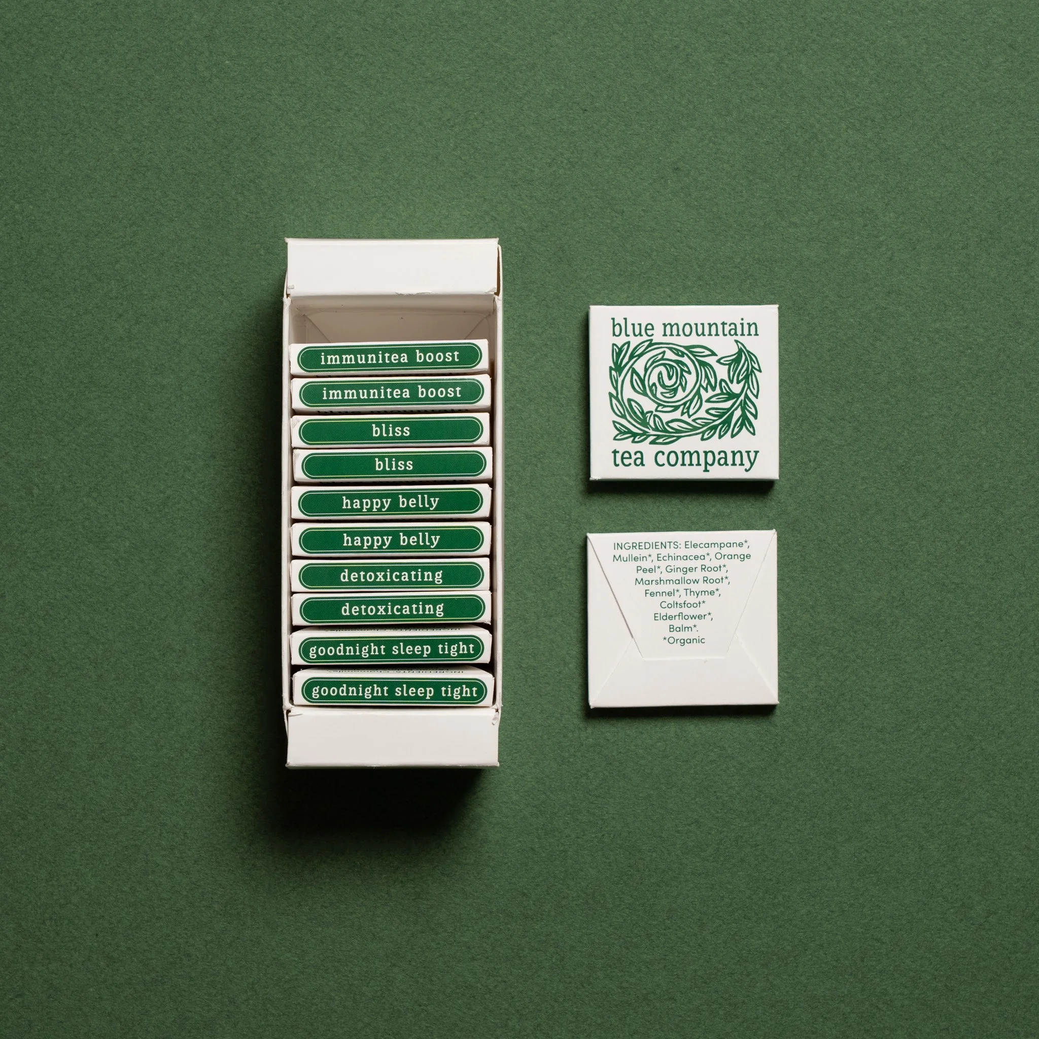
Designing a tea sampler concept that introduces the brand to new customers
Ensuring the owner felt confident expanding into new distribution channels
Balancing fresh, stylish aesthetics with authenticity to the brand's Collingwood roots
Our Strategic Design Solution
Our comprehensive rebrand honoured Blue Mountain Tea's heritage while creating a sophisticated foundation for growth. The solution balanced brand evolution with familiar elements that existing customers loved. We stylized and refined the owner's beloved swirl element, maintaining emotional connection with existing customers while elevating its execution for professional retail environments. The refreshed identity captured the peaceful, premium experience of quality tea while feeling fresh and contemporary—appealing to both loyal customers and new retail audiences. Every design decision supported the owner's broader business goals, creating visual identity she could confidently present to retail buyers and e-commerce customers.
We implemented a dual primary colour palette—blue for caffeinated teas and green for caffeine-free options—enabling instant visual recognition. This colour-coding system speeded purchasing decisions both online and on-shelf, allowing customers to quickly identify the right product for their needs without reading detailed labels.
Comprehensive Packaging Design
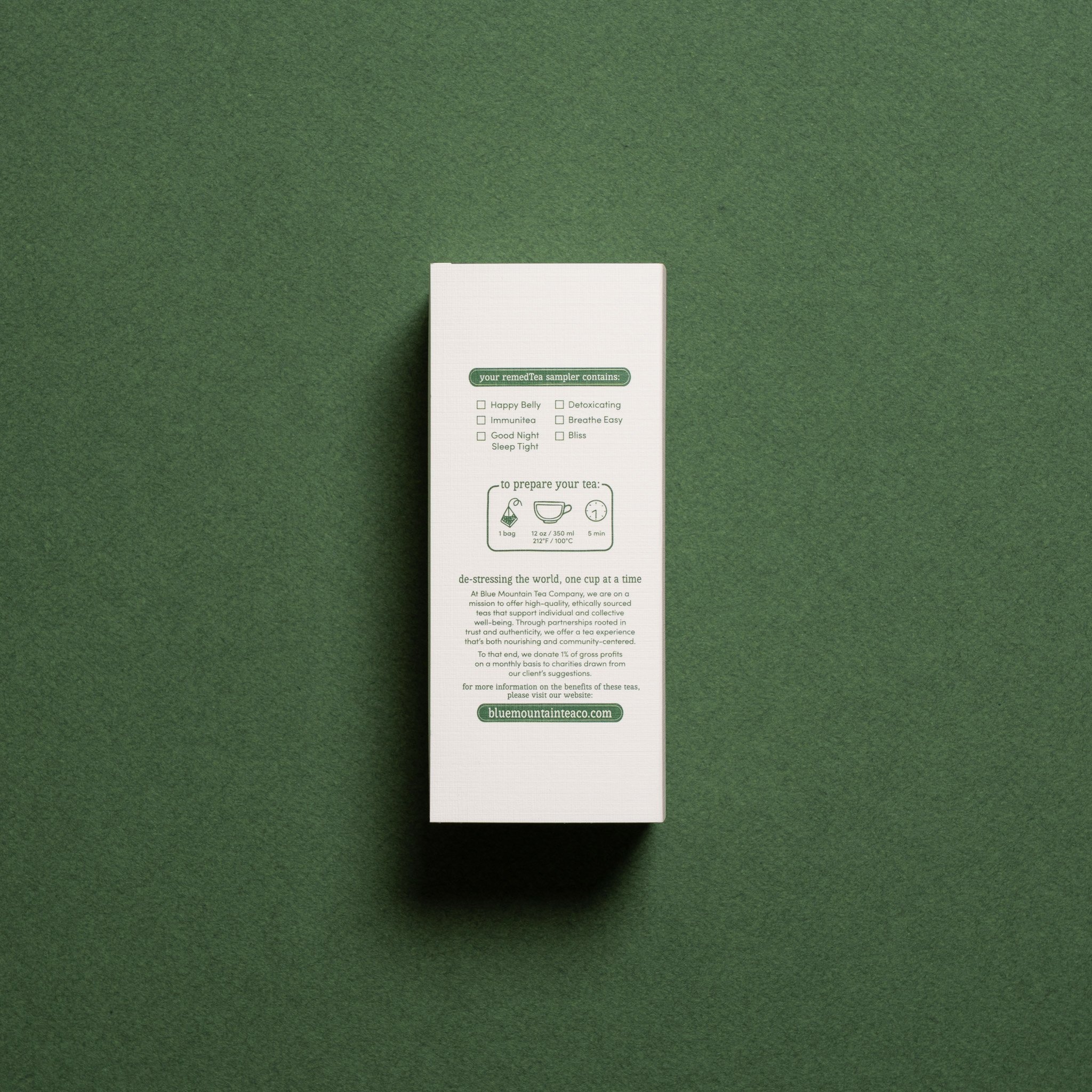
Designed packaging that protected tea freshness while showcasing the refined brand identity across multiple tea varieties.
Created a distinct sampler packaging design perfectly executed by Pique Packaging, providing an ideal introduction product for new customers and gift-giving occasions.
Packaging works seamlessly across in-store display, e-commerce shipping, and retail distribution, maintaining consistent brand experience regardless of purchase channel.
Supporting materials reinforced the elevated brand identity across all customer touchpoints, from point-of-sale displays to digital marketing assets, ensuring cohesive brand presentation.
Results & Market Reception
The Blue Mountain Tea rebrand successfully achieved all expansion objectives:
Consumer Response: Customers instantly connected with the new look, finding it fresh and stylish while remaining true to the brand's roots—the perfect balance of evolution and authenticity.
Owner Confidence: The owner now feels confident expanding her brand, knowing the visual identity aligns with her broader business goals and can compete in professional retail environments.
Efficient Shopping Experience: The blue/green colour-coding system dramatically improved customer experience, enabling quick product selection both online and in-store.
Growth Foundation: With a strong visual foundation in place, the brand is set to flourish in new spaces while staying authentic to its Collingwood origins.
Conclusion
Blue Mountain Tea Company's rebrand demonstrates how thoughtful design evolution can position local success stories for broader market growth. By refining the beloved signature swirl, implementing strategic colour-coding, and creating polished packaging across multiple formats, we gave the brand a professional foundation for retail expansion while maintaining authentic connection to its Collingwood roots.
The dual-colour palette system (blue for caffeinated, green for caffeine-free) exemplifies how functional design choices can simultaneously improve customer experience and create distinctive brand recognition. Consumers now navigate the product line effortlessly while the brand stands out in competitive retail environments.
Most importantly, the owner's confidence in her expanded brand vision validates the rebrand's success. The fresh, stylish aesthetic remains true to the brand's calming, premium nature while supporting ambitious growth goals. Blue Mountain Tea is now positioned to flourish in e-commerce and retail markets, bringing their quality teas to broader audiences while maintaining the authentic experience that built their loyal local following.
PHOTO CREDITS: GIBB Design