Rebranding & Packaging Redesign Projects
Making your brand look as good as it tastes.
What do customers think of your product when you aren't in the room to sell it? For over 17 years, we have crafted visual identities for food companies, ensuring their shelf presence matches their quality.
We specialize in partnering with founders who have successfully bootstrapped their first decade and are now ready to evolve from a business into a legacy brand.
Frozen Food Line Packaging Refresh
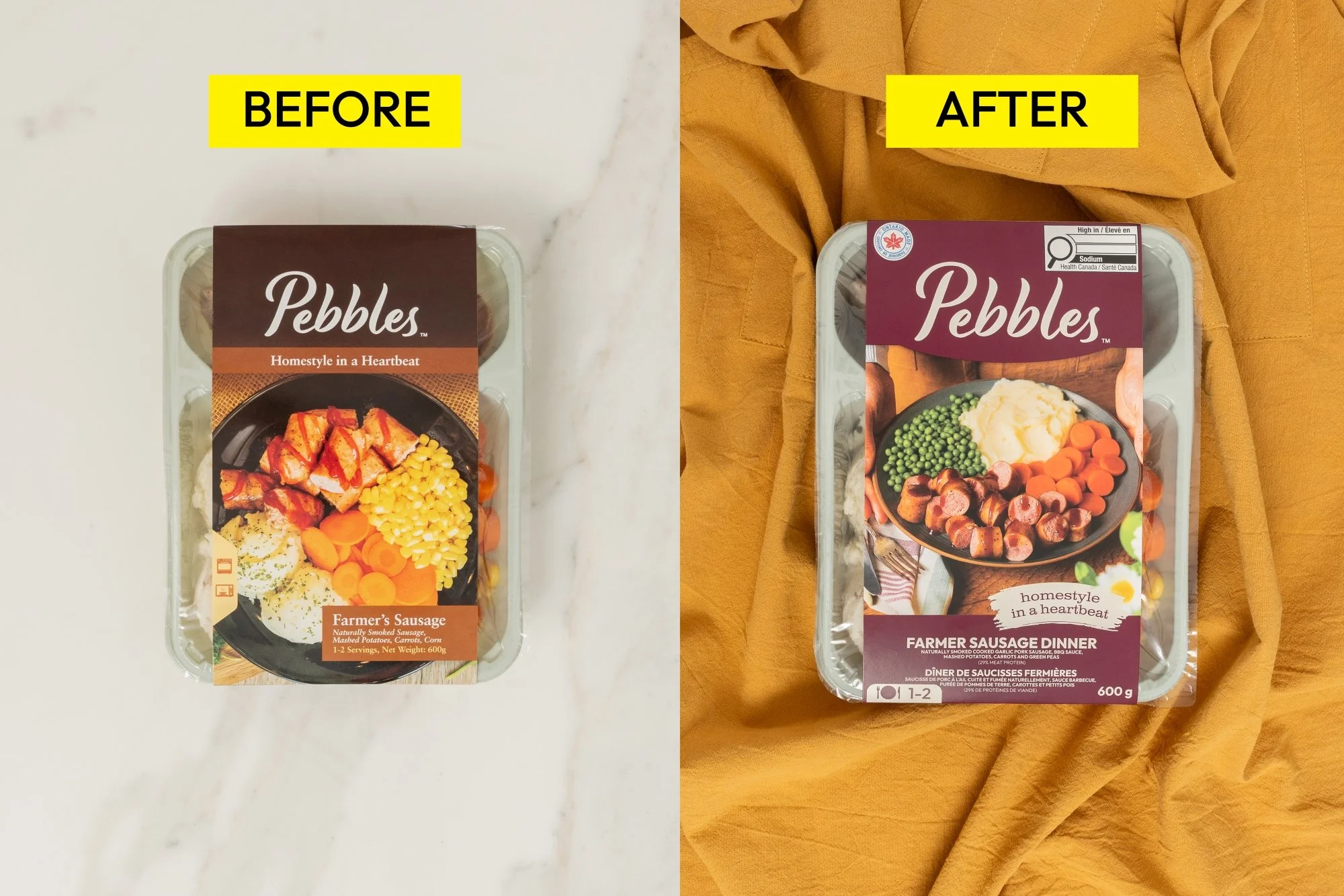
For over two decades, Pebbles Family Buffet has been Durham, Ontario's go-to spot for homestyle comfort food. When they launched a line of frozen dinners made from their restaurant recipes, Canada's new 2026 Front-of-Package nutrition labelling requirement gave them a hard deadline, and the opportunity to modernize packaging that had aged out of step with the brand's quality.
Rather than bolt the mandatory Health Canada symbol onto the existing design, we started with a full audit of the frozen aisle, then built a warm, burgundy-forward system with hands-on-the-table food photography that stood apart from the category's cold blues and clinical beauty shots. The result: fully compliant packaging that kept Pebbles' homestyle credibility intact while giving it real shelf presence for a broader, urban grocery audience.
Artisan Caramel Rebrand
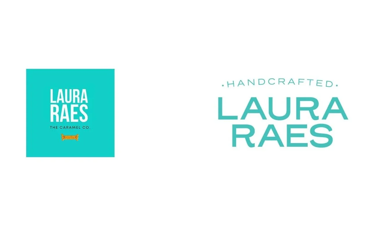
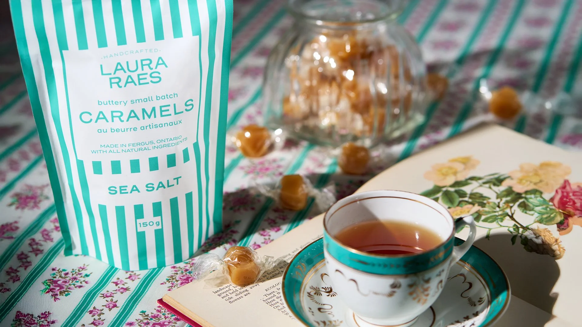
Laura Raes began as a pandemic passion project—a way for founder Sheri Visakaly to escape corporate life. While her signature candies were an instant success, the DIY visual identity quickly struggled to keep pace with the quality of the product.
We stepped in to bridge that gap. Respecting the brand equity Sheri had already built, we preserved her distinct signature teal but completely modernized the logo assets and visual system. This refresh gave the brand the professional polish it needed to graduate from a home business to a competitor in major retail chains and the corporate gift market.
“We hired Amanda to transform the colours and vibe of our existing brand kit into bold and memorable labels for our milk, gelato, yogurt and smoothies. Her industry knowledge and experience of food labeling, nutritional facts, and French language requirements were invaluable during the process. It made our lives easier to offload these tasks to a professional with this specific experience. She was a pleasure to work with and we loved that she was local as well. When we are ready to expand our product line, we will reach out for her services without hesitation.”

BEFORE & AFTER
Coastal Coffee Rebrand
Owners Ben and Bri began their roasting journey in the back of their green hippie van, and they haven’t stopped. Their enthusiasm and zest for life is apparent in everything they do, and the time had come to elevate their packaging and branding to reflect this and to differentiate themselves in order to penetrate more of the e-commerce and retail market.
This project began with a branding refresh, where it was agreed that the iconic van graphic should be preserved, but strengthened, and with the business name more tightly integrated into the art. The green colour was also updated to a more vibrant shade, in better keeping with the brand’s personality.
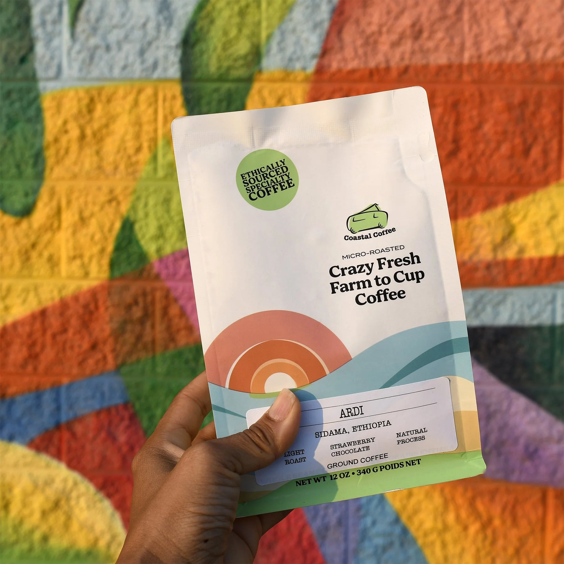
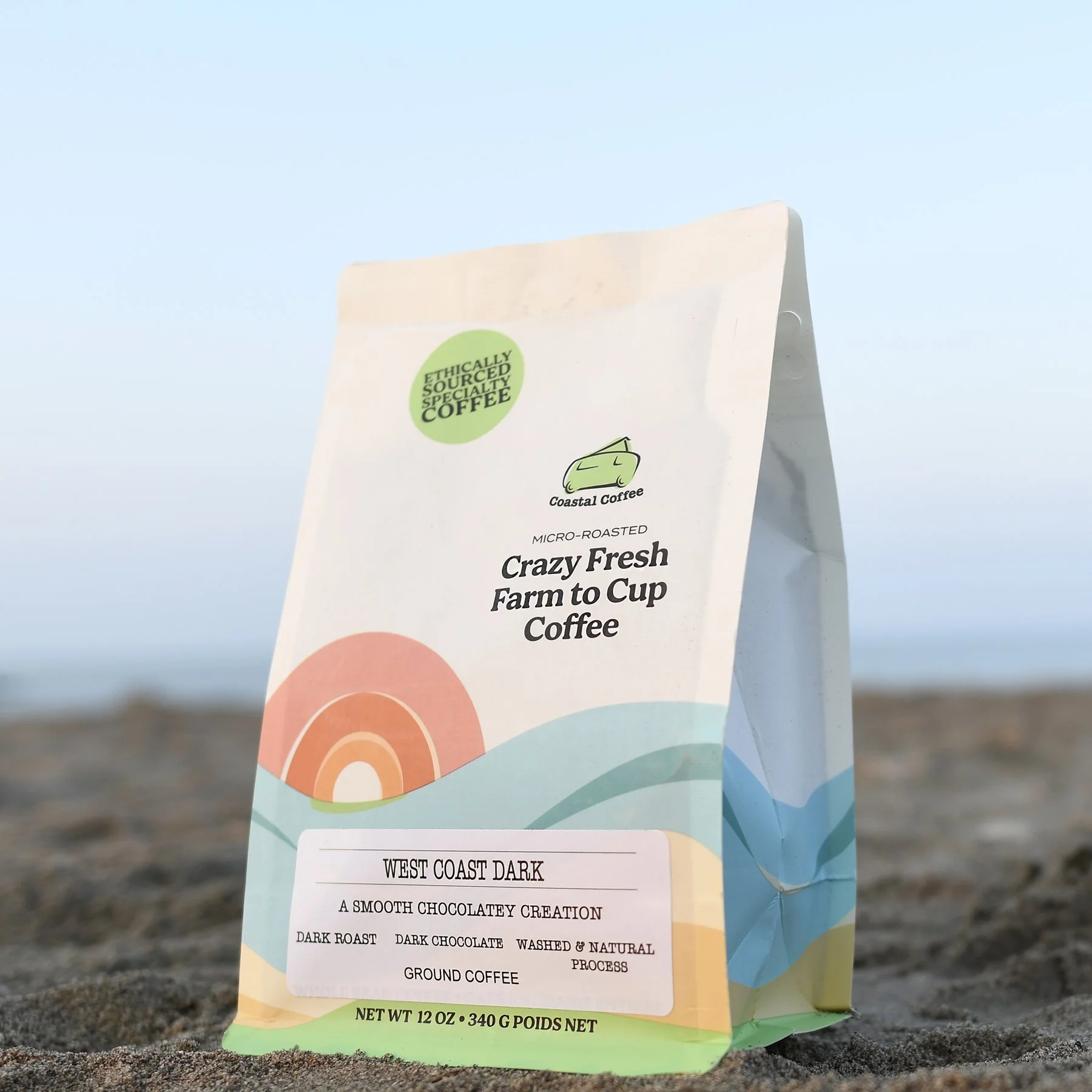
before & after
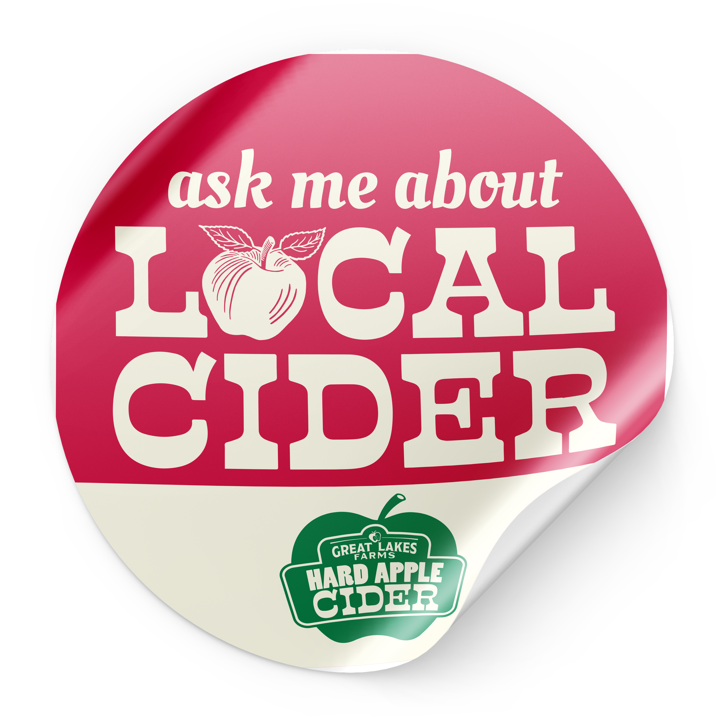
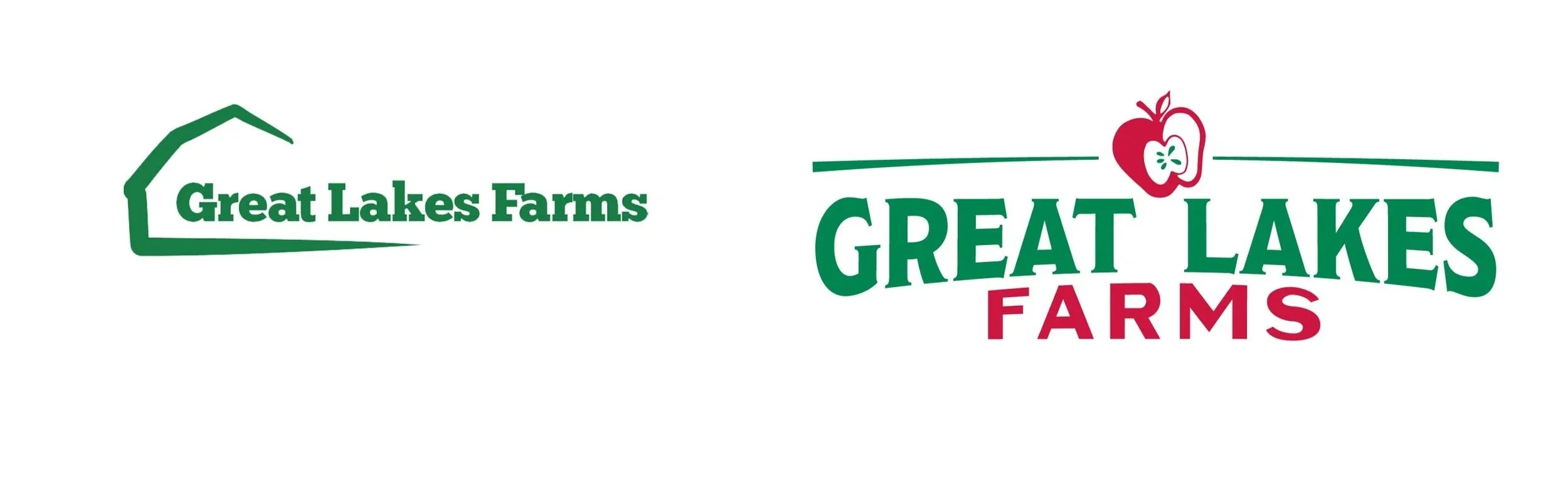
Great Lakes Farms Rebrand
Following the complete rebranding of Great Lakes Farms, we turned our focus to their newest venture: an estate-grown hard cider. With 100% of the apples harvested directly from their orchard, the visual identity needed to reflect the authentic, artisanal nature of the product.
We designed a packaging system that highlights the specific apple varietals used in each blend, educating the consumer while reinforcing the "orchard-fresh" promise. The resulting design cuts through a crowded cider market with a premium look that scales effortlessly from bottles to cans, establishing the line as a high-quality staple on the shelf.
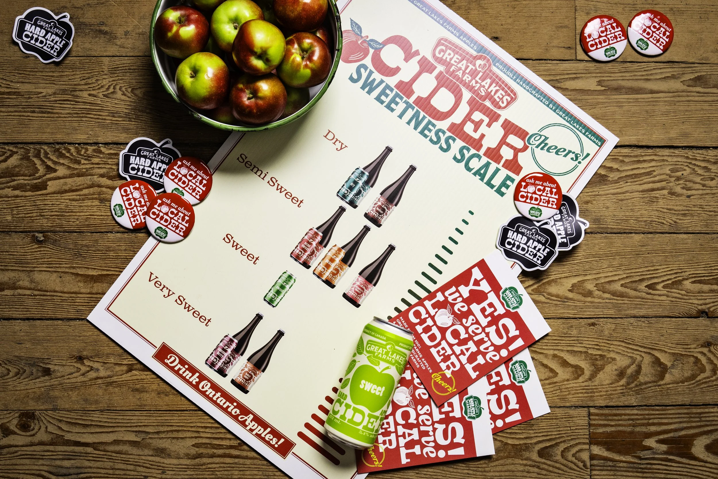
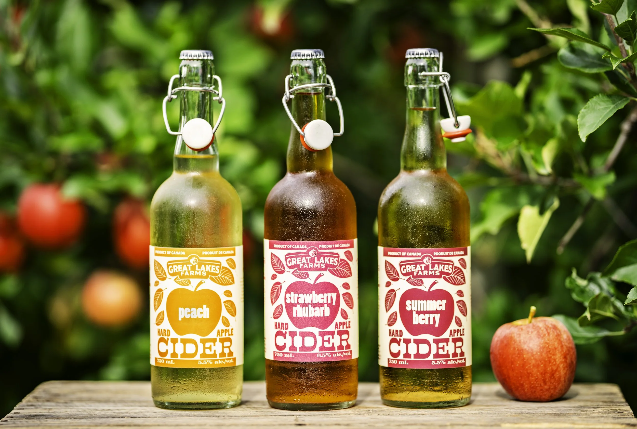
before & after
Refreshed identity for an omni-channel expansion, from single shop to select retail
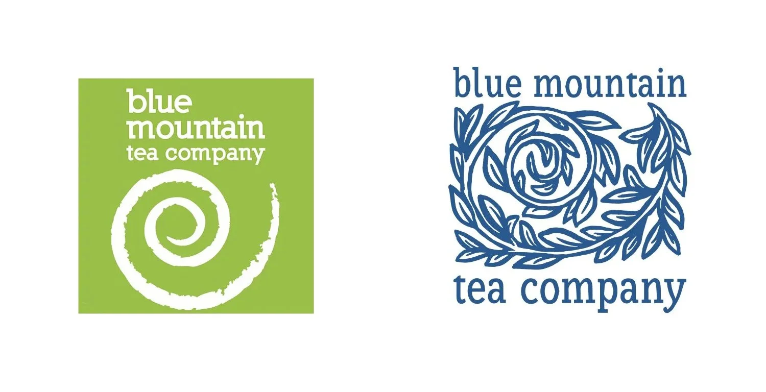
Blue Mountain Tea Company was already a Collingwood staple with a thriving in-store experience, but owner Katherine Maxwell was ready to scale into e-commerce and wider retail. Our challenge was to polish the brand for a national audience while maintaining the "swirl" icon her local customers loved.
We developed a complete rebrand and a strategic packaging system, including an award-winning tea sampler concept executed by Pique Packaging.
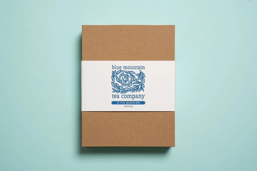
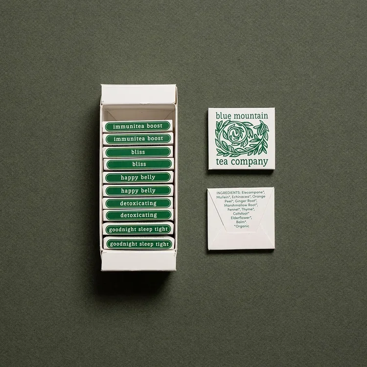
““...the new product we launched, which Eye Candy Design was instrumental in designing the packaging for, has *recouped the total cost of the design investment in three months of sales*. In my opinion, this is directly linked to the look and clever format of the packaging.””
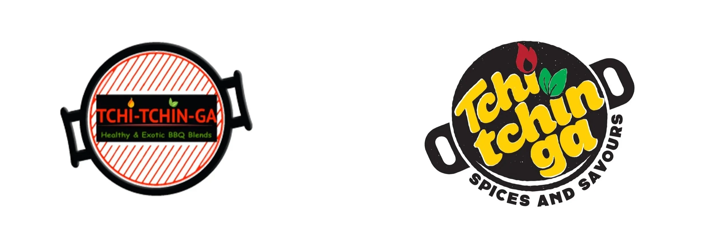
BEFORE & AFTER
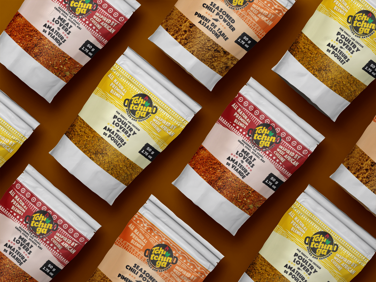
Tchitchinga: Seasoning Blends inspired by Togo
Food entrepreneur Nadia is proud of her heritage and its strong roots in food preparation and is keen to share these flavours with her new Canadian home.
We developed a visual identity behind the name “Tchtchinga”, which means barbecue, and then produced a tasty line-up of seasoning blends with bold colours and graphics.