

Rebel Chocolate is a Montreal-made specialty liquid chocolate built for baristas, chefs, and anyone who refuses to settle for the squeeze-bottle stuff.
Made with real, ethically sourced, single-origin, organic direct trade cocoa and organic cane sugar, it's crafted for hot and cold drinks — and food — with none of the fillers, stabilizers or shortcuts found in typical chocolate sauces.
BRANDING
PACKAGING
The Challenge
Rebel Chocolate came to us with a genuinely great product and an even stronger point of view: real ingredients, single-origin, organic, direct trade cocoa, and zero interest in blending in with the wall of chocolate sauces already lining café back bars across the country.
The challenge was building a brand and packaging system that could do two jobs at once. Communicate serious ingredient credentials (organic, ethically sourced, direct trade, single origin, organic cane sugar) to the buyers who care about that, while still feeling energetic and confident enough to live up to the name. It also had to work hard in a real foodservice environment: large-format 2.4L pouches that get reached for multiple times a shift, in both English and French Canadian markets.
The Strategy
We started with the name. Rebel isn't shy about what it's pushing against — bland, over-processed chocolate syrup loaded with fillers — or what it stands for instead: chocolate made with the same level of care as the espresso it gets poured into.
So we built a brand that wears its attitude on its sleeve but backs it up with substance. Bold typography, punchy colour, and packaging that reads premium and a little provocative — never precious, never sleepy.
The goal was simple: make a 2.4L bag of chocolate feel like something a barista would be excited to pull off the shelf — and proud to have visible behind the counter.
The Visual Identity
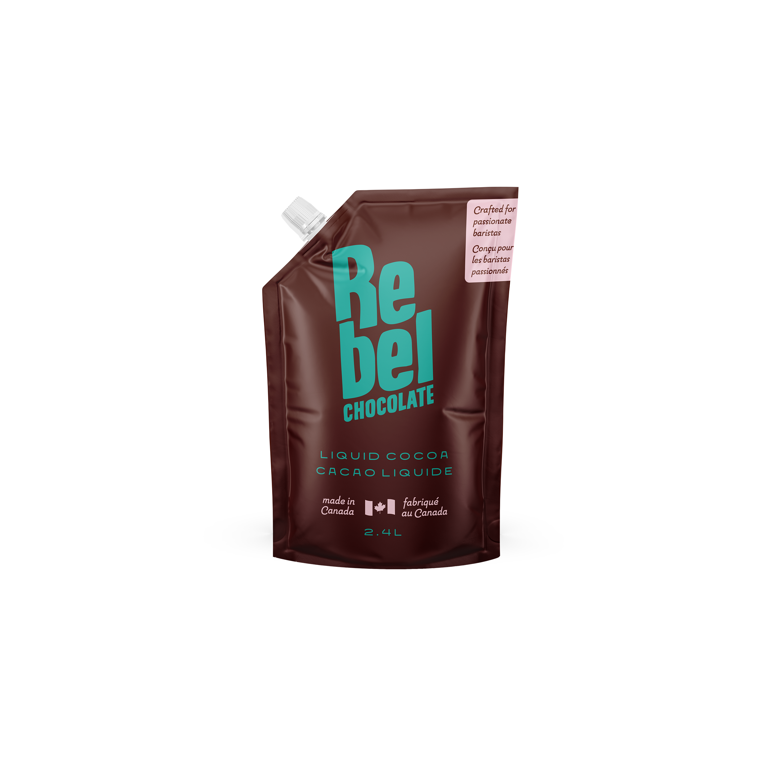
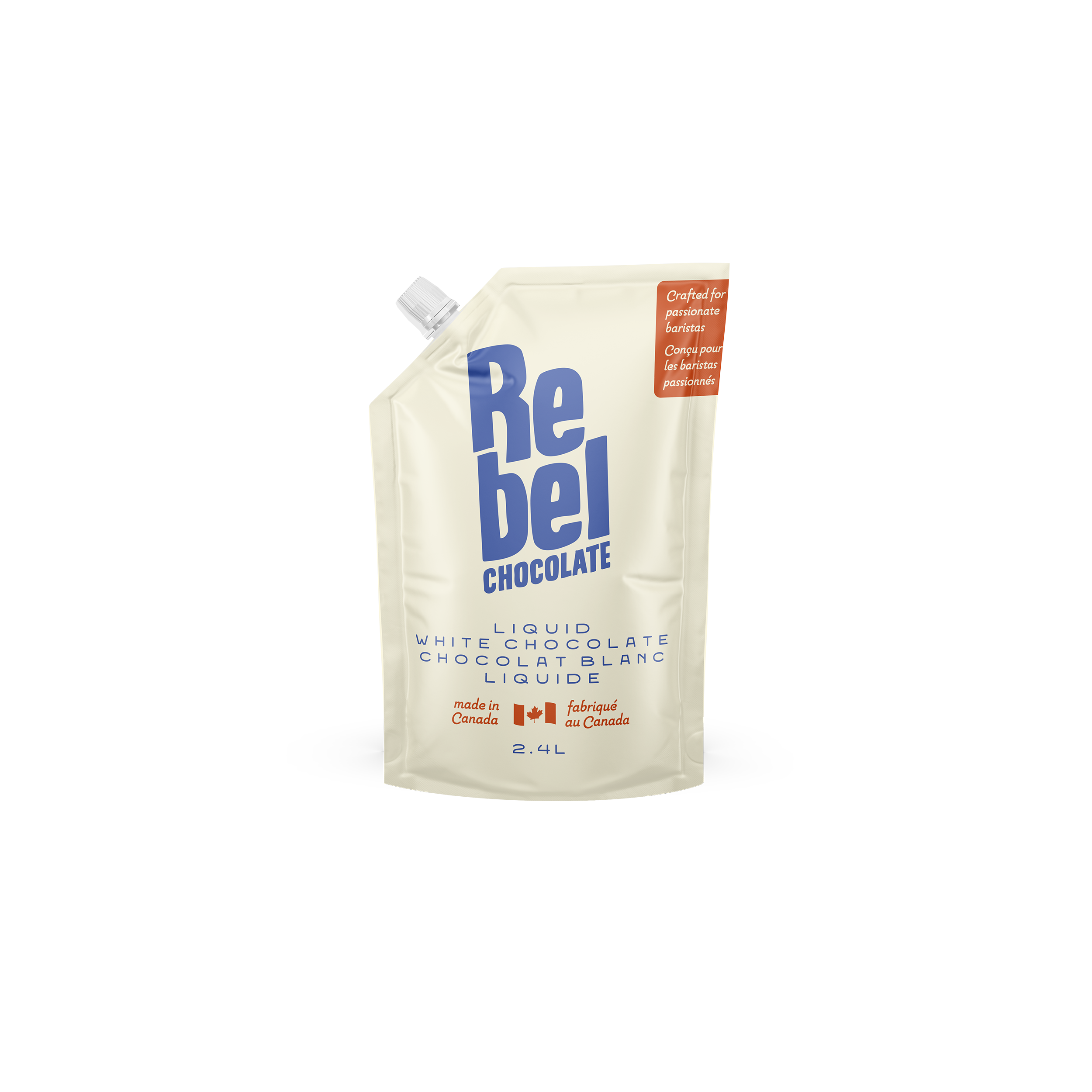
The wordmark is the heart of the system — a chunky, rounded Re bel lockup, stacked and oversized, with CHOCOLATE anchoring it underneath in a tighter, no-nonsense caps treatment. It's friendly enough to feel approachable, but big and confident enough to hold its own on a 2.4L pouch from across a café.
For the flavour system, we built a colour-flip structure so the line reads as a family while keeping each SKU instantly identifiable:
Liquid White Chocolate uses a soft cream base with the Rebel wordmark in a cool periwinkle blue, balanced by a warm terracotta accent block.
Liquid Cocoa flips the formula — a rich dark cocoa-brown base with the wordmark in a fresh teal, balanced by a soft blush accent block.
The result is a system where the two flavours feel like clear siblings, not afterthoughts — easy to tell apart at a glance, but unmistakably part of the same family.
We kept the format itself simple and functional: a 2.4L spouted stand-up pouch designed for real barista workflows — easy to pour, easy to store, and easy to refill into squeeze bottles behind the bar.
Voice & Messaging
The tone had to match the name without tipping into gimmicky. "Crafted for passionate baristas" does a lot of work in just a few words — it tells the buyer exactly who this is for, while signalling that this isn't a budget syrup that happened to wander into a specialty café.
The product copy stays direct and ingredient-forward letting the quality story speak plainly, while the Rebel name and bold colour system carry the personality.
The Results
What started as a 2.4L bag of chocolate is now a flexible little brand system, one that can grow into new flavours and formats without losing what makes it Rebel in the first place. The colour-flip structure means future SKUs (think dark chocolate, or a seasonal flavour) can slot right in, instantly recognizable as part of the family.
For a category that's long been dominated by anonymous foodservice packaging, Rebel Chocolate now has something most squeeze bottles never get: a personality, and the ingredient story to back it up.