
Specialty Cultural Foods Packaging Design
Building on the success of their fermented foods line, The Harvest Pantry expanded into specialty cultural food items that occupy a unique niche in the culinary landscape. These products, while distinct in their cultural origins and flavour profiles, needed to maintain brand consistency with The Harvest Pantry's established identity while honouring their authentic cultural heritage.
CLIENT: HARVEST PANTRY
“Super!! love the colors and it’s boldness! Thanks! Yeah! Beauty!”
PACKAGING
MARKETING
The Challenge: Balancing Cultural Authenticity with Brand Consistency
Problem
The Harvest Pantry faced a sophisticated design challenge: how to create packaging for specialty cultural foods that would:
Maintain strong brand recognition within The Harvest Pantry family
Honour the distinct cultural origins of each product
Appeal to both adventurous food enthusiasts and consumers from specific cultural backgrounds
Stand out in the niche specialty foods section
Communicate authenticity while ensuring brand cohesion
Each product represented a different cultural tradition, requiring careful consideration of visual elements that would resonate with diverse consumer groups while maintaining the bold shelf presence that had made their fermented foods line so successful.
Our Design Solution: Cultural Respect Meets Brand Excellence
Solution
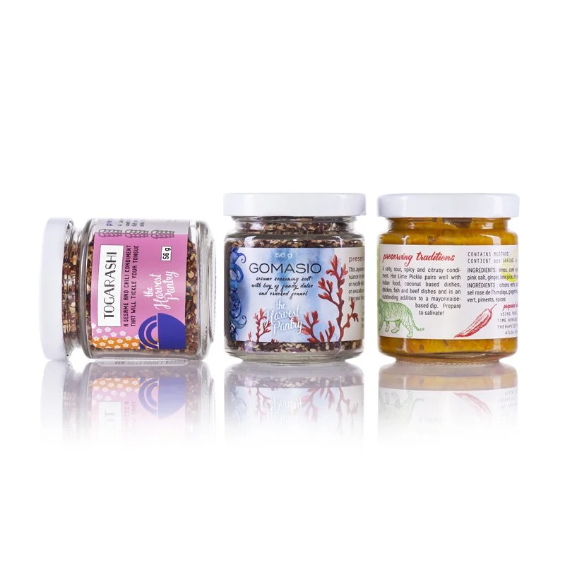
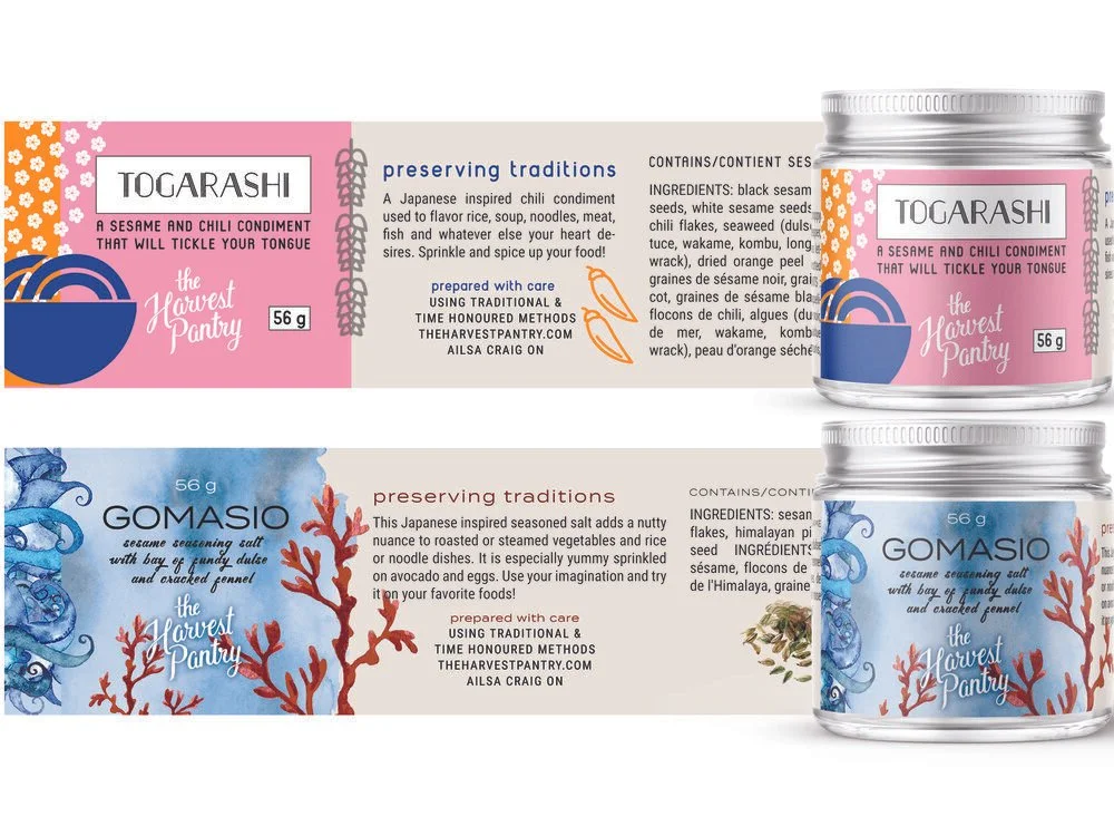
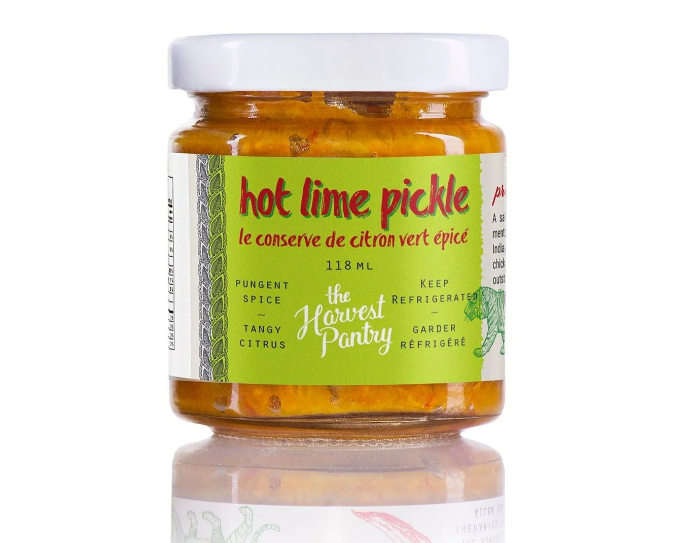
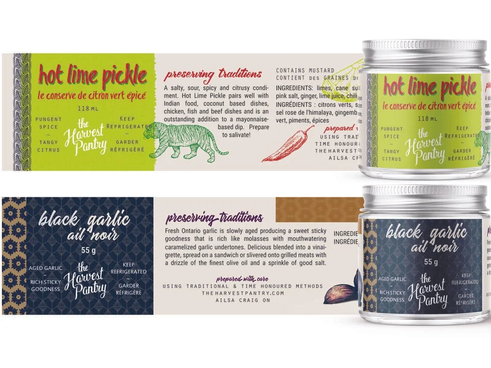
We developed a rigorous design template system that struck the perfect balance between brand consistency and cultural authenticity. This approach ensured that each product maintained The Harvest Pantry's recognizable look-and-feel while incorporating individual graphics and colours that strongly identified with each product's ingredients and cultural origins.
Systematic Cultural Integration: The template framework allowed us to incorporate culturally appropriate colour palettes, typography elements, and graphic motifs that would resonate with consumers familiar with these traditional foods while remaining accessible to curious newcomers.
Ingredient-Driven Visual Language: Each product's packaging featured graphics and colours directly inspired by its key ingredients and cultural heritage, creating an authentic connection between the visual design and the product's story.
Brand Cohesion Strategy: Despite the diverse cultural influences, the rigorous template system ensured that all products were immediately recognizable as part of The Harvest Pantry family, maintaining the brand equity built through their successful fermented foods line.
Results: Authentic Cultural Foods with Strong Brand Identity
Results
The specialty cultural foods packaging successfully:
Created a cohesive product line that honoured diverse cultural traditions
Maintained strong brand recognition while celebrating authenticity
Positioned The Harvest Pantry as a curator of quality cultural foods
Attracted both heritage consumers and adventurous food enthusiasts
Strengthened the brand's reputation for authenticity and cultural respect
Conclusion: Celebrating Diversity Through Strategic Design
This specialty foods line demonstrates how thoughtful packaging design can bridge cultural authenticity with brand consistency. By creating a flexible system that honours diverse culinary traditions while maintaining brand recognition, we helped The Harvest Pantry expand their offerings while staying true to their commitment to quality and cultural respect.