
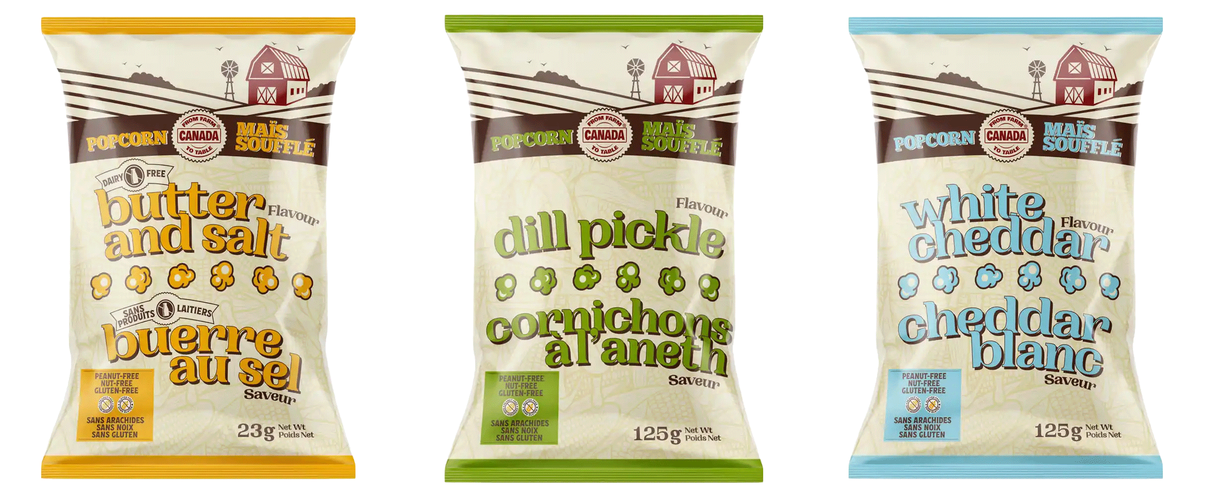
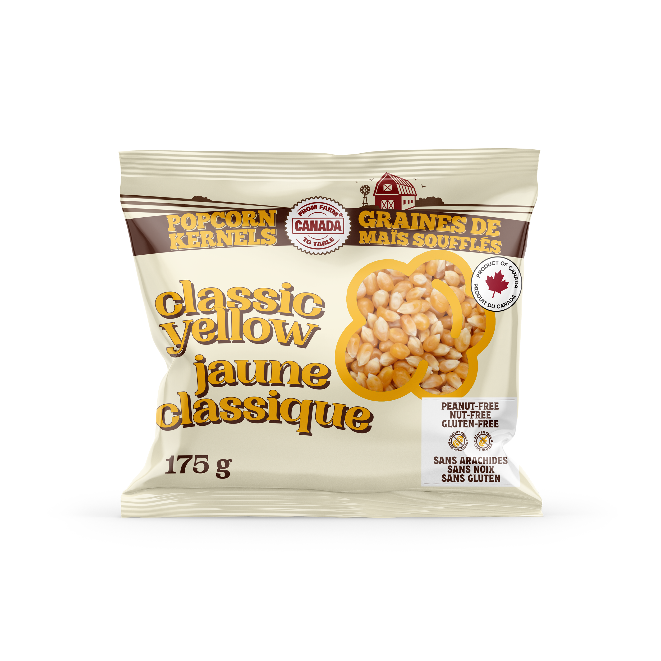
Streamlined Farm-Fresh Packaging Design

From Farm to Table Canada needed packaging that clearly communicated their unique value proposition while reducing costly printing expenses. Eye Candy Design streamlined the colour palette, converted the farm photo into a focal illustration, and selected typefaces that created an authentic Ontario farm feel.
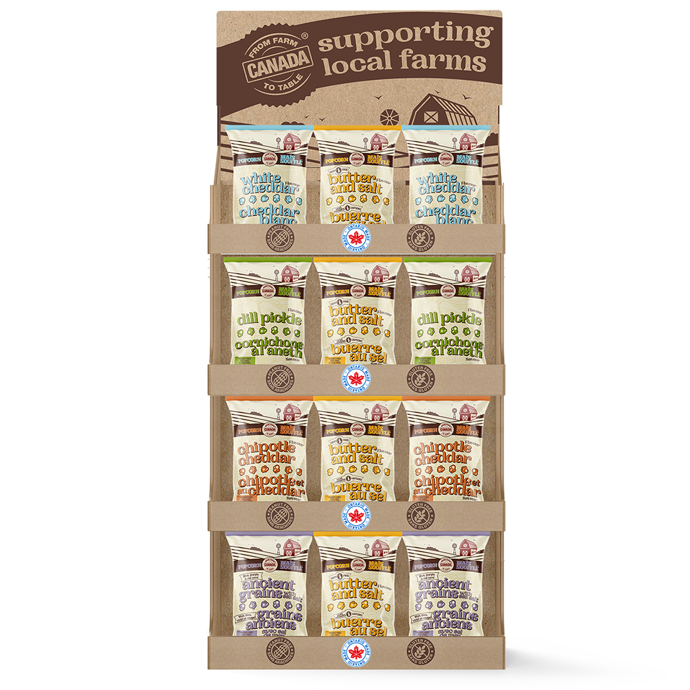
The result: packaging that instantly communicates the company's local sourcing mission, even from a distance, with expanded applications including retail displays and new flavour formats.
CLIENT: FROM FARM TO TABLE CANADA
PACKAGING
RETAIL-READY BOXES
MARKETING COLLATERAL
The Challenge
Unclear Value Proposition and High Production Costs
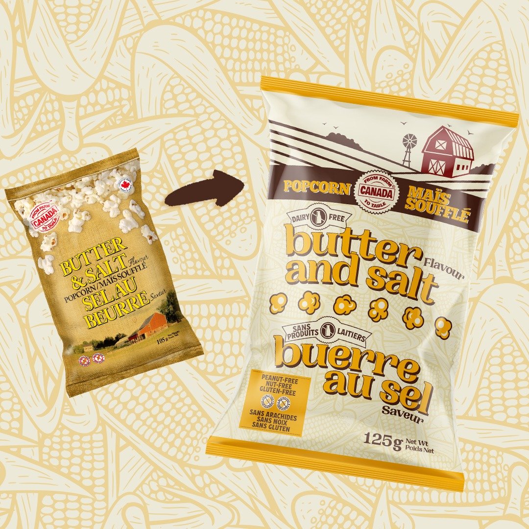
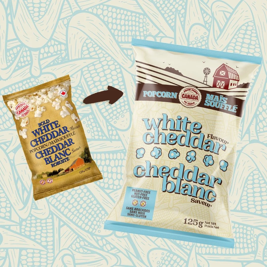
The existing packaging failed to clearly communicate From Farm to Table Canada's unique local sourcing story while excessive colour usage created unnecessary printing expenses.
Key challenges:
Value proposition wasn't immediately clear to consumers
Too many colours driving up printing plate costs
Farm photography wasn't creating sufficient impact
Brand identity needed stronger Ontario farm authenticity
Required retail-ready display solutions
Needed scalable system for new flavours and formats
Our Strategic Design Solution
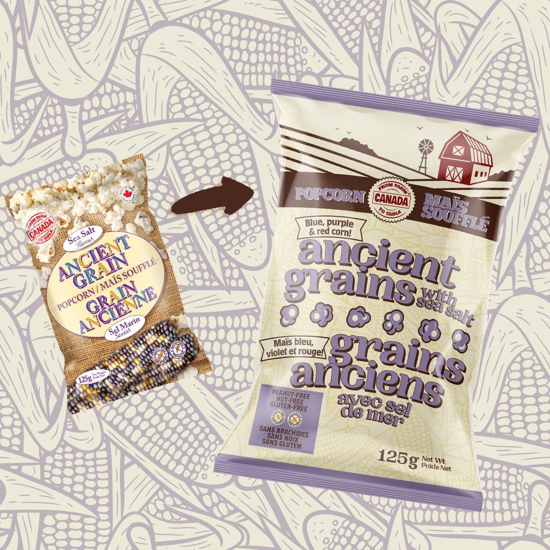
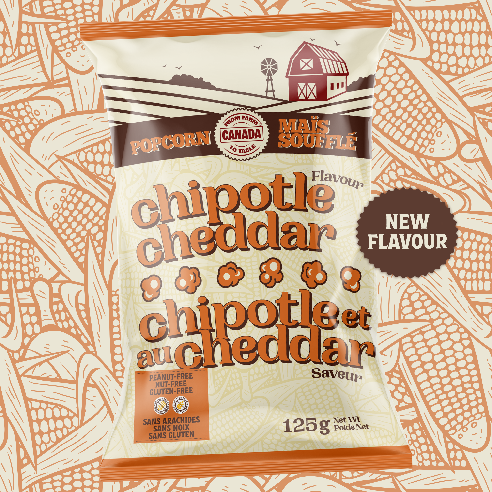
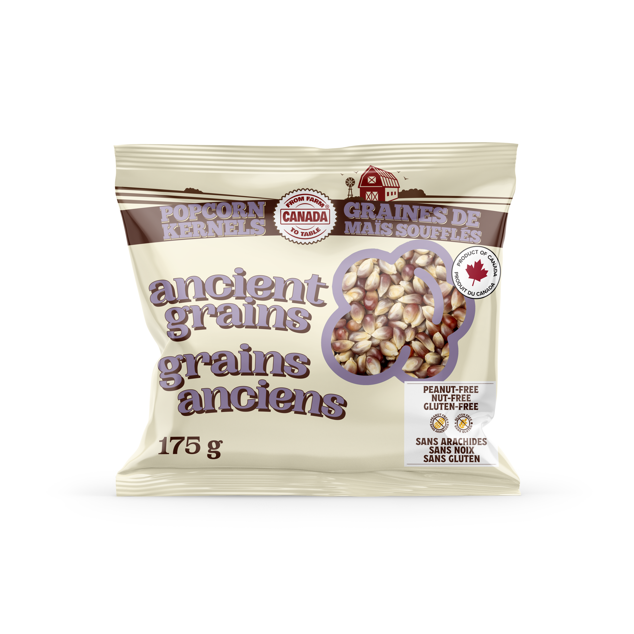
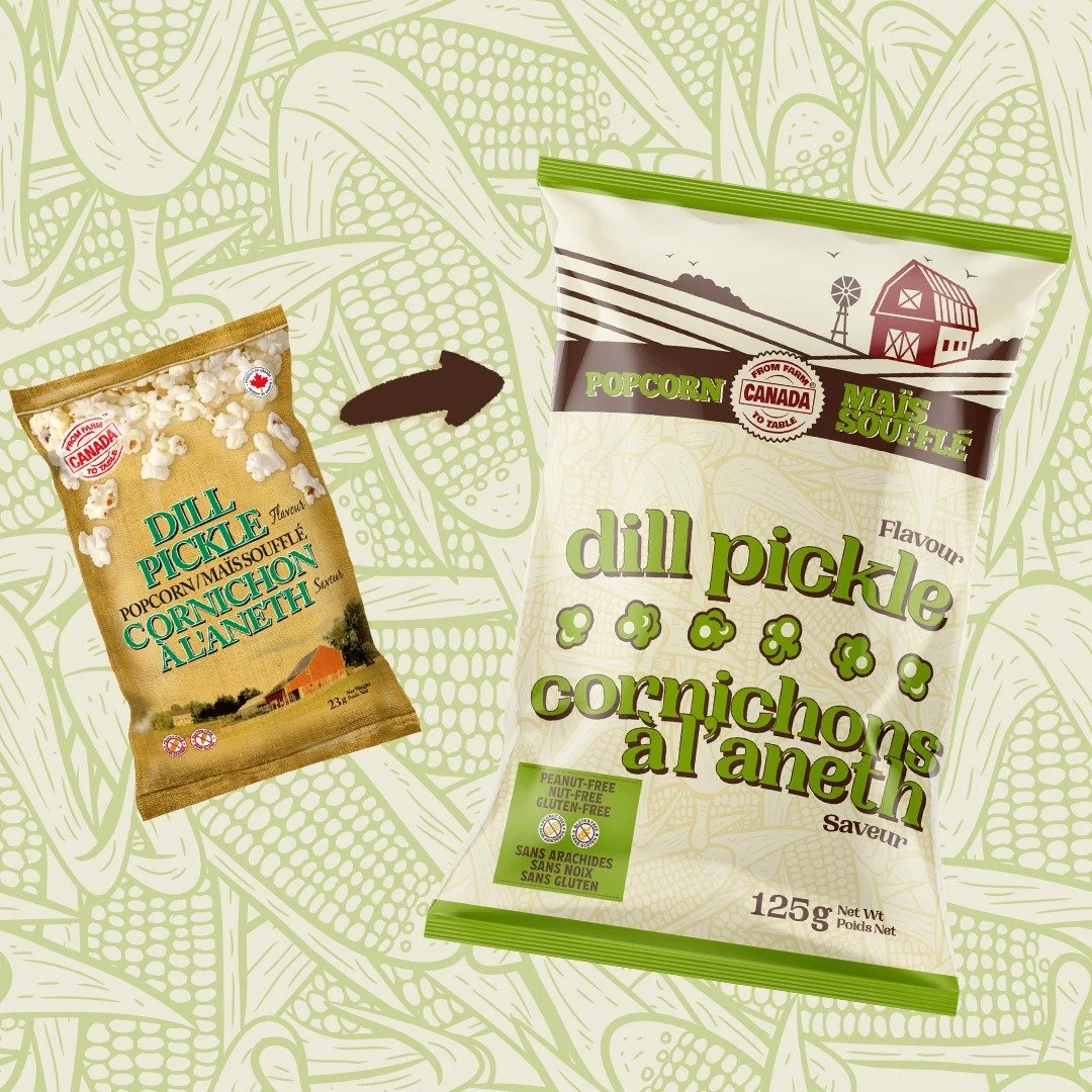
We simplified the colour system, reducing printing costs while creating more cohesive, visually appealing design that complemented the natural freshness of the products. Converting the farm photo into an illustration brought charm and authenticity front and centre, immediately communicating the Ontario farm origin story and local sourcing commitment. Selected typefaces that exuded warmth and down-to-earth authenticity, creating emotional connection with consumers seeking genuine farm products. The redesign ensured that even from a distance, consumers immediately understood the company's commitment to supporting local Ontario farmers and sustainable food practices. Extended the design system to retail-ready displays for shelf impact and smaller format packaging for new flavours, maintaining consistency while adding variety.
Clear Communication Meets Cost Savings
The packaging redesign achieved dual objectives of clarity and efficiency:
Consumers now instantly understand the local farm sourcing mission, making purchasing decisions easier and building brand connection.
Streamlined colour palette significantly lowered printing expenses without sacrificing visual impact.
The farm illustration and authentic typography created cohesive identity that resonates with target audience seeking local, sustainable food.
Purpose-designed displays enhanced shelf presence, while the scalable system supported product line expansion.
The packaging now tells the brand story effectively, making it easy for consumers to connect with From Farm to Table's mission.
Conclusion
From Farm to Table Canada's packaging transformation demonstrates how strategic design creates both aesthetic and economic value. By streamlining colours, creating a bold farm illustration centrepiece, and selecting authentic typography, we clarified the local sourcing mission while reducing production costs.
The redesigned packaging, retail displays, and expanded product formats created strong, cohesive brand identity that truly reflects the company's values and resonates with consumers seeking authentic Ontario farm products.