
Strategic Redesign for Natural Energy Bar Retail Expansion
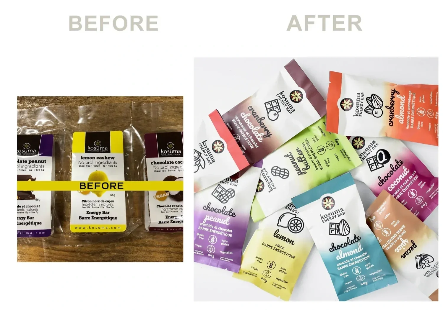
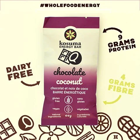
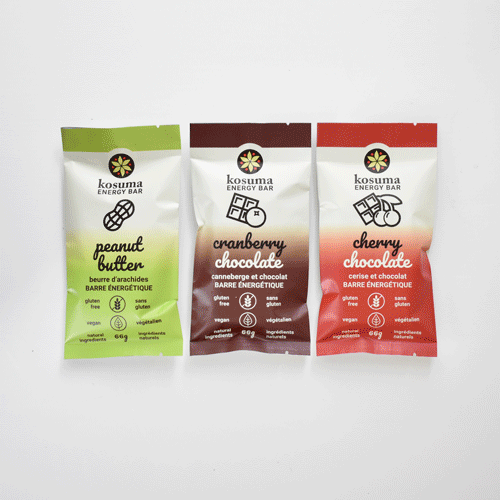
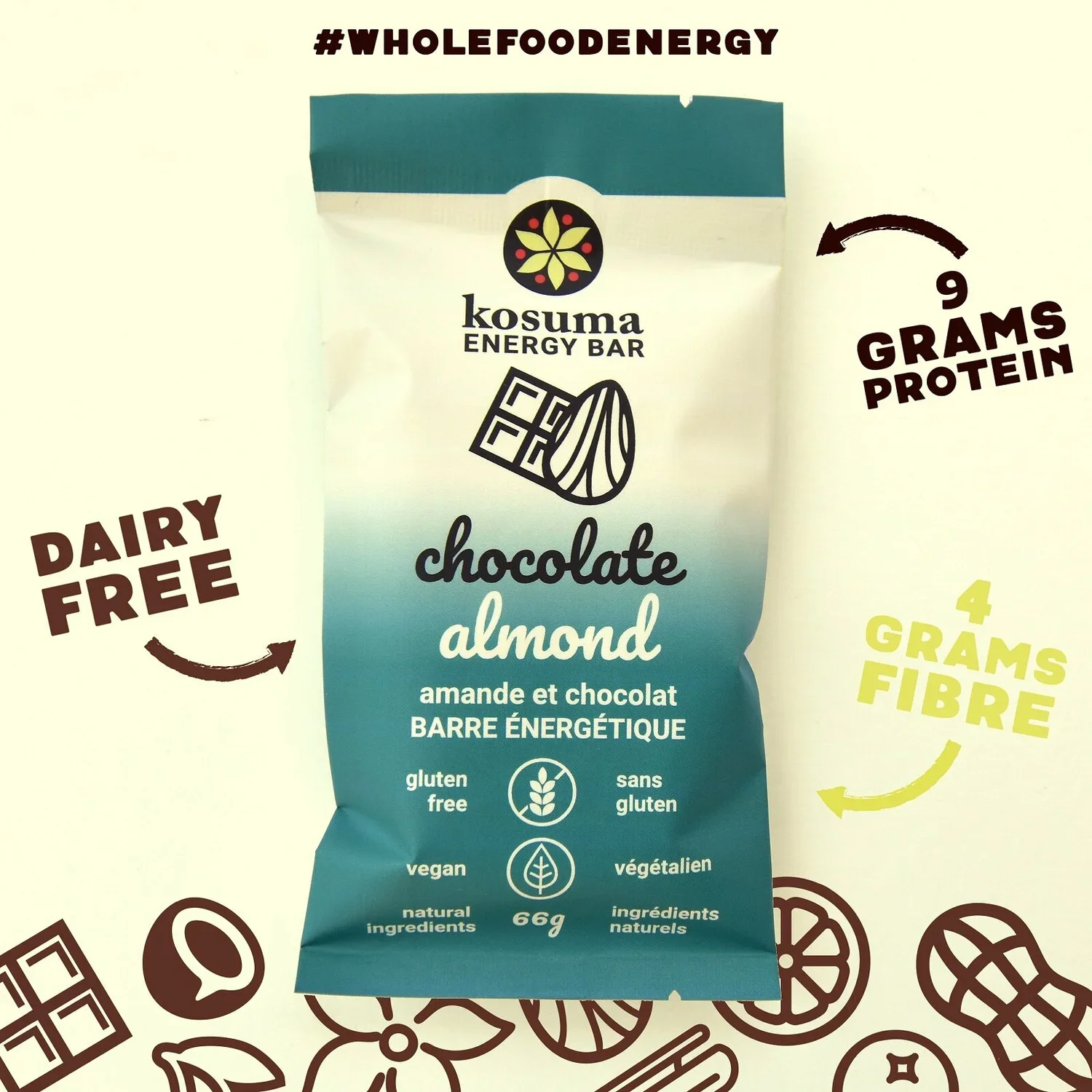
Kosuma Energy Bars needed professional packaging to compete with established all-natural, vegan energy bar brands as they expanded into retail grocery. Eye Candy Design researched the competitive landscape, selected matte packaging with foil lining for contemporary aesthetics and extended shelf life, and created an icon system illustrating the simple, whole food ingredients. The redesign had immediate impact—sales increased so dramatically that ordering and fulfillment routines required complete overhaul.
CLIENT: KOSUMA ENERGY BAR
“Amanda recently helped us to rebrand our business and we were so thrilled with her work. Not only is she incredibly talented, but she also took the time to get to know us on a personal level to create the perfect look to represent our business...She is patient, flexible, down to earth and very professional.”
REBRANDING
PACKAGING DESIGN
MARKETING COLLATERAL
The Challenge
Competing in Established Natural Energy Bar Market
Kosuma needed to compete at the same level as comparable all-natural, vegan energy bars in retail grocery environments.
Key challenges:
Existing packaging lacked professional polish for retail expansion
Needed to stand out in crowded natural energy bar category
Required material selection balancing aesthetics with shelf life
Simple whole food ingredients needed clear communication
Must compete with established brands without overwhelming consumers
Our Strategic Design Solution
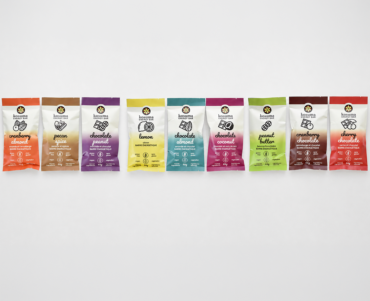
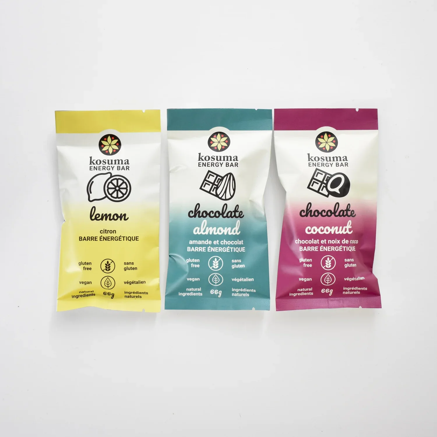
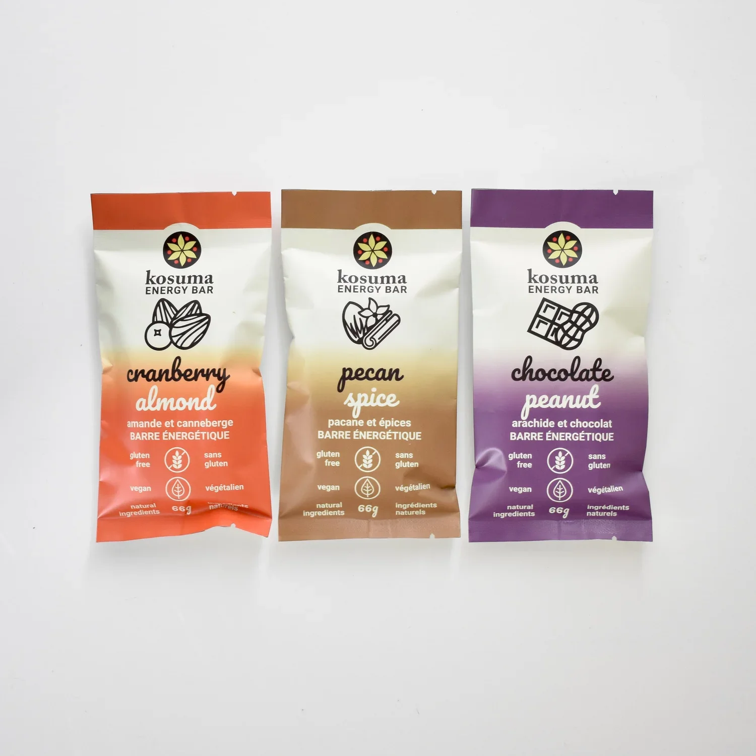
Conducted thorough research into competitive landscape, understanding what top natural energy bar brands were doing and identifying opportunities for differentiation. Selected matte finish with foil lining—providing contemporary look that appealed to health-conscious consumers while extending shelf life through proper food protection. Created visual icons representing each whole food ingredient, allowing consumers to understand bar contents at a glance without reading lengthy ingredient lists. The design reflected the product's natural simplicity—completely natural whole foods with no artificial ingredients, communicated through clean, straightforward visual approach.
Immediate Sales Increase and Operational Transformation
The packaging redesign created dramatic business results:
Owners reported immediate effect on sales following packaging launch.
Sales uptick was so significant that ordering and fulfillment routines required dramatic changes to accommodate increased demand.
Professional packaging positioned Kosuma to compete effectively with established all-natural, vegan energy bar brands in retail grocery.
Icon system successfully communicated whole food ingredients quickly, supporting purchasing decisions.
Conclusion
Kosuma Energy Bars demonstrates how strategic packaging redesign drives measurable business results. By researching competition, selecting smart materials, and creating clear ingredient communication through icons, we positioned Kosuma to compete effectively in the natural energy bar market.
The immediate sales increase requiring operational transformation proves that professional packaging isn't just aesthetic—it's a powerful business driver that can transform retail performance.