
Streamliners Espresso Bar:
Vintage Train Ticket Coffee Labels for Anniversary Release
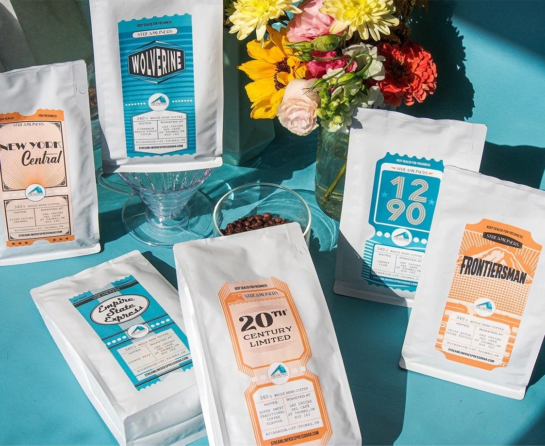
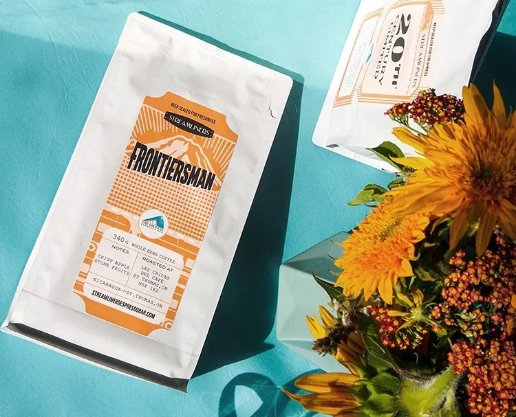
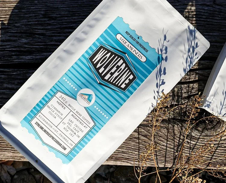
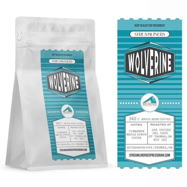
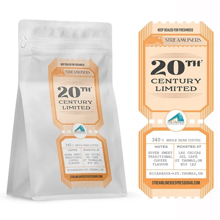
Streamliners Espresso Bar commemorated their third anniversary with a special release of six unique coffee blends, each named after historic streamliner trains that once graced the city's iconic train station. Eye Candy Design created visually stunning labels featuring a vintage matte finish and die-cut train ticket shape that married two compelling themes: the local railway heritage and the journey of coffee from Nicaragua to Ontario. The labels became a major driver of the anniversary release's success.
CLIENT: STREAMLINERS ESPRESSO BAR
BRANDING
PACKAGING
SIGNAGE
MERCHANDISE
MARKETING
The Challenge
Creating Collectible Limited-Edition Coffee Packaging
Anniversary and limited-edition releases present unique packaging opportunities in the specialty coffee market. These releases must create excitement, communicate special occasion status, and become collectible items that deepen customer loyalty. The challenge was designing packaging that would celebrate Streamliners' milestone while honouring the brand's train-themed identity and the coffee's origin story.
Key challenges included:
Creating packaging worthy of a significant business anniversary celebration
Honouring the streamliner train theme in a fresh, memorable way
Differentiating six unique coffee blends while maintaining series cohesion
Balancing vintage nostalgia with contemporary specialty coffee aesthetics
Connecting local railway history with international coffee sourcing story
Producing labels that customers would want to collect and display
Our Strategic Design Solution
Die-Cut Train Tickets Meet Vintage Matte Finish
Our design approach transformed the coffee labels into authentic vintage artifacts that celebrated both local history and the coffee's journey from farm to cup.
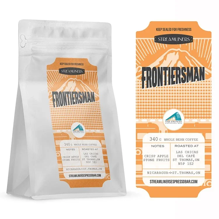
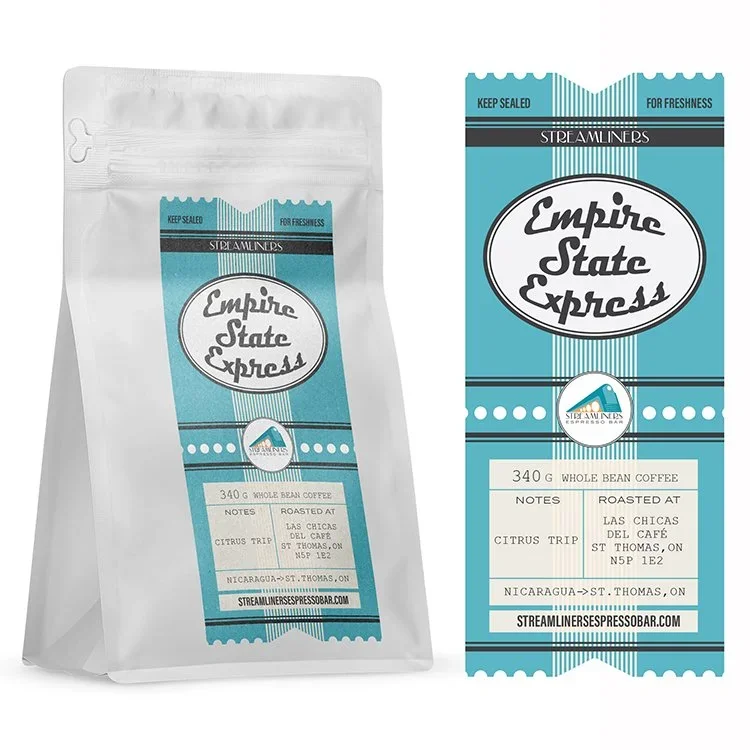
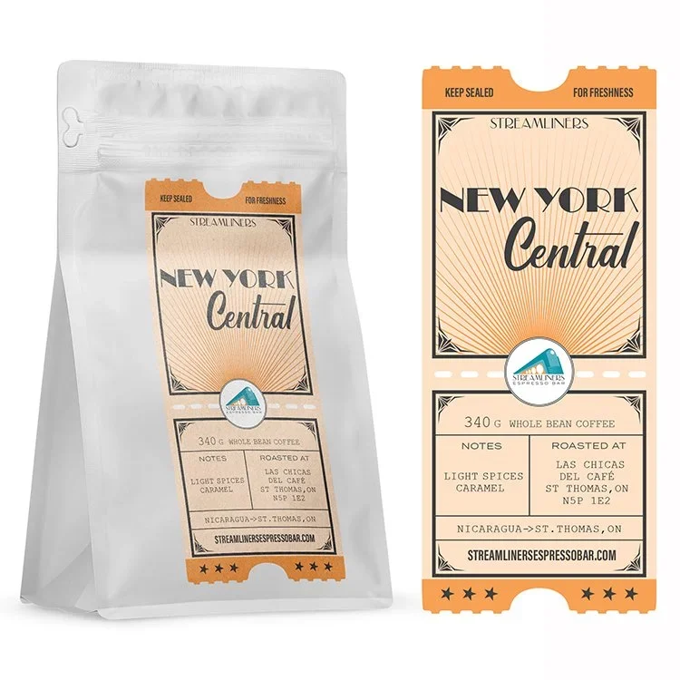
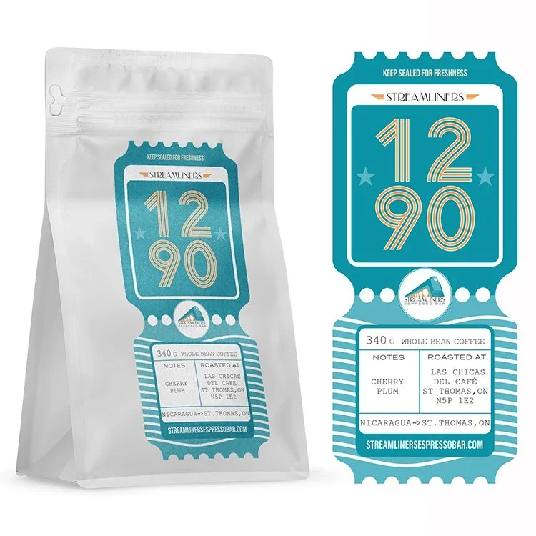
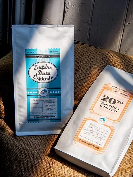
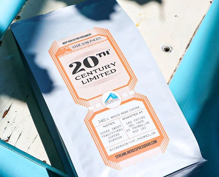
Die-Cut Train Ticket Shape
Authentic Form Factor: We designed labels die-cut to the shape of vintage train tickets, creating an immediately recognizable and tactile connection to the streamliner theme—transforming each bag into a collectible piece of railway nostalgia.
Dual Journey Narrative: The train ticket shape cleverly communicated two stories simultaneously: the historic streamliner trains of the local station and the journey of the Nicaraguan coffee beans traveling to Ontario customers.
Collectible Appeal: The distinctive shape created instant collectibility, encouraging customers to purchase multiple blends and display the labels—turning packaging into keepsakes that extend brand engagement beyond consumption.
Vintage Visual Treatment
Matte Finish: We specified a beautiful matte finish that enhanced the vintage aesthetic while providing an elevated tactile experience that specialty coffee customers appreciate.
Period Typography: Carefully researched typography reflected the streamliner era, creating authentic vintage appeal while maintaining readability and modern design sensibilities.
Color Differentiation: Each of the six blends received distinctive color treatment that enabled easy identification while maintaining the cohesive vintage aesthetic across the series.
Heritage Storytelling
Train-Specific Naming: Each blend was named after specific streamliner trains that historically passed through the city's station—Wolverine, 20th Century, ESE, and others—creating educational connections to local history.
Extensive Research: We conducted thorough research into streamliner train history to ensure authentic representation, supporting the brand's commitment to meaningful storytelling through packaging.
Brand Alignment: The vintage aesthetic reinforced Streamliners Espresso Bar's established train-themed identity while elevating it for this special anniversary occasion.
Results & Customer Response
Anniversary Success Through Collectible Packaging
The Streamliners anniversary coffee labels achieved exceptional market reception:
Major Success Driver: The labels were "a major part of the success" of the anniversary release, demonstrating how exceptional packaging can drive sales for limited-edition specialty coffee.
Customer Enthusiasm: Customers responded enthusiastically to both the blends and the collectible labels, with positive feedback highlighting the visual appeal and historical storytelling.
Brand Celebration: The packaging successfully commemorated three years of business while reinforcing the brand's unique train-themed identity and commitment to quality.
Collectibility Factor: The die-cut train ticket shape and vintage finish created genuine collectible appeal, encouraging customers to purchase the complete series.
Local History Connection: The labels strengthened Streamliners' connection to local community heritage, positioning the coffee shop as a steward of railway history.
Key Insights for Anniversary Coffee Packaging
Shape as Storytelling: Die-cut packaging shapes can communicate brand themes more powerfully than graphics alone—the train ticket form immediately conveyed the heritage concept.
Limited Editions Demand Excellence: Anniversary and special releases justify elevated packaging investment because customers expect premium presentation for milestone celebrations.
Dual Narratives Create Depth: The best specialty coffee packaging tells multiple stories simultaneously—local history and coffee origin—creating richer customer engagement.
Vintage Aesthetics Require Research: Authentic period design requires thorough historical research to avoid clichés and create genuinely resonant vintage appeal.
Collectibility Drives Multiple Purchases: Packaging designed as collectible series encourages customers to purchase all variants, increasing average transaction value.
Matte Finishes Elevate Perception: Tactile elements like matte finishes create premium perception that supports specialty coffee positioning and pricing.
The Power of Themed Packaging
Collaboration and Creativity
The Streamliners project exemplifies how passionate collaboration between coffee shop and design agency can create exceptional results. The owner's vision for celebrating their anniversary with train-named blends provided the creative foundation, while our execution through die-cut shapes and vintage finishing brought that vision to life in a way that exceeded expectations.
The labels demonstrate that specialty coffee packaging can be more than information delivery—it can be artifact, education, art, and brand storytelling simultaneously. For local businesses with unique themes and stories, packaging becomes a powerful tool for community connection and customer loyalty.
Conclusion
The Streamliners Espresso Bar anniversary labels demonstrate how thoughtful, themed packaging can transform a special release into a memorable brand moment. By designing die-cut train ticket labels with vintage matte finish, we created packaging that honored local railway heritage, told the coffee's journey story, and became collectible items that customers treasured.
The success of this project—with labels being "a major part" of the anniversary release's positive reception—validates the investment in premium packaging for milestone celebrations. The vintage aesthetic, authentic die-cut shape, and period-appropriate typography created labels that feel like genuine historical artifacts while functioning as contemporary specialty coffee packaging.
Most importantly, the labels reinforced Streamliners Espresso Bar's unique brand identity and community connection. By celebrating both the historic streamliner trains and the journey of Nicaraguan coffee to Ontario customers, the packaging created meaningful storytelling that deepened customer engagement and supported business growth. We're excited to continue supporting Streamliners in future releases and look forward to seeing how this exceptional local business continues to thrive.