Nostalgic Heritage Packaging Design for Traditional British-Style Cheese Made in Ontario
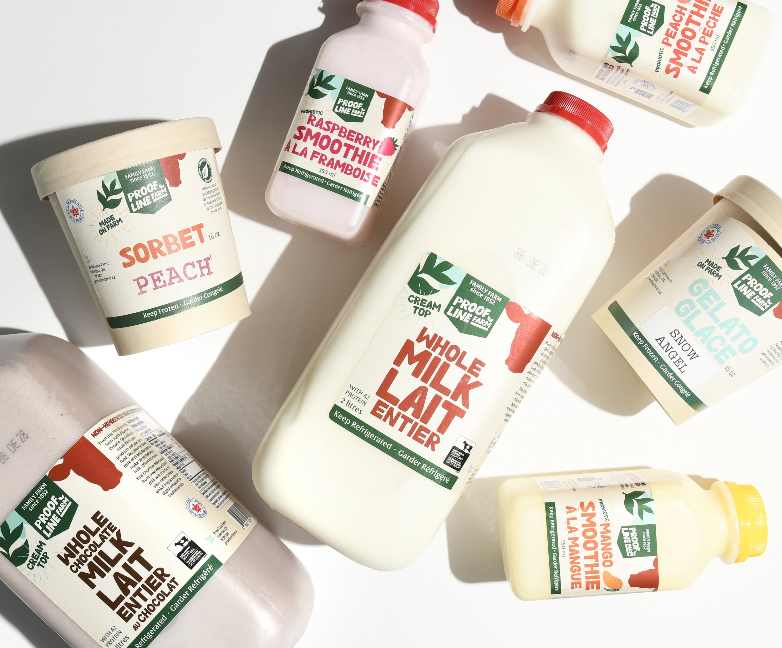
An Ontario-based dairy producer sought to create distinctive packaging for their British-style cheeses—products made in Canada but crafted to evoke deep nostalgia for traditional British comfort foods. Working with the client's existing brand identity, Eye Candy Design developed comprehensive packaging that draws from Scottish and rural British heritage cues, creating designs that speak to homesickness while appealing to new customers seeking wholesome, traditional dairy quality.
PACKAGING
SELL SHEETS


The Challenge
Translating Cultural Heritage into Retail Packaging
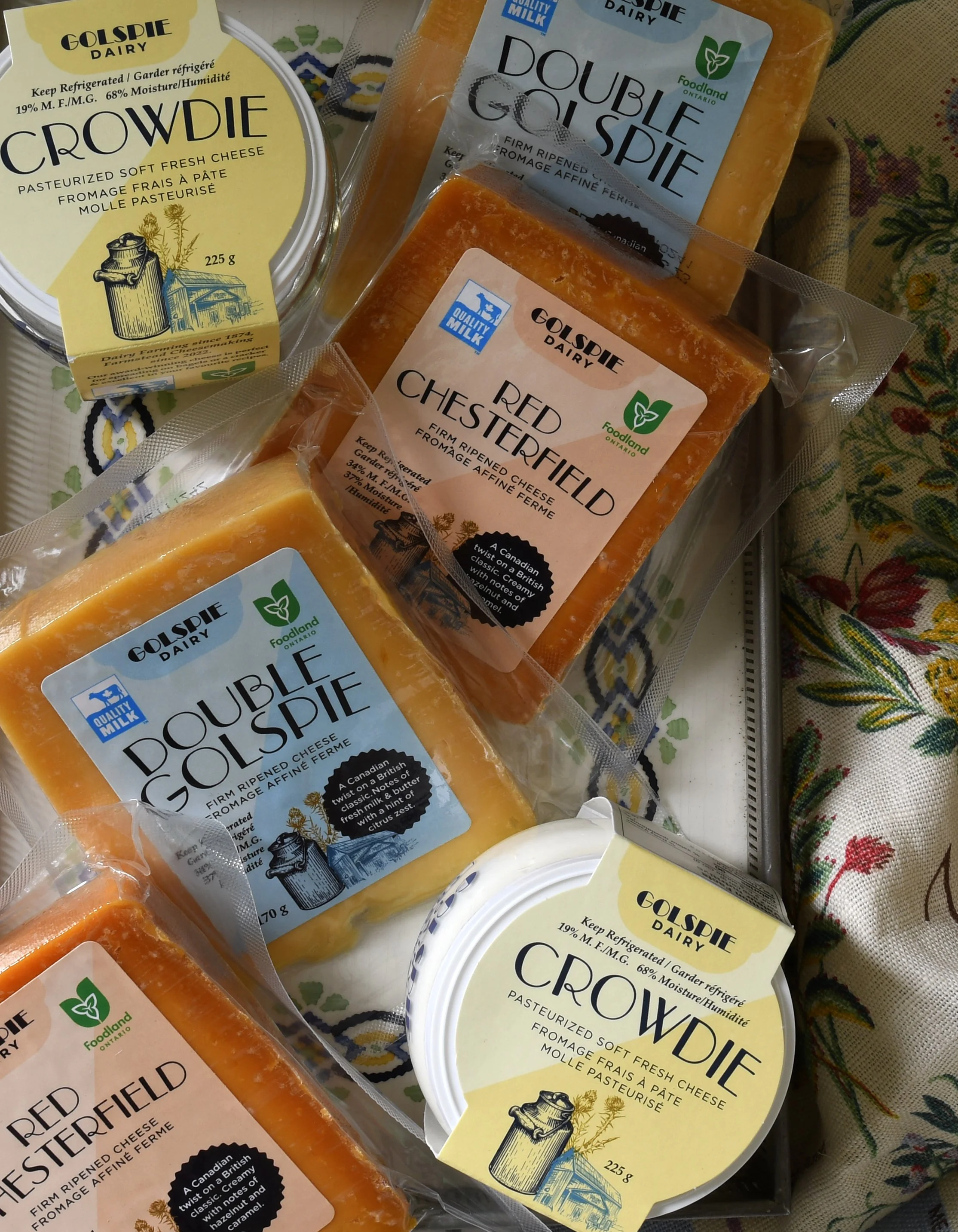
Ontario has a rich cheese-making history dating back to the mid-1800s when British settlers introduced cheddar-making traditions. By the turn of the 20th century, Ontario had 1,242 cheddar factories, with Canadian cheddar even being exported back to England. Today, Ontario producers continue this British-Canadian dairy legacy.
The challenge was creating authentic British heritage packaging for Ontario-made cheese that would:
Evoke genuine nostalgia for British comfort foods without feeling manufactured or artificial
Appeal to expatriates and British heritage communities seeking familiar tastes
Attract mainstream Canadian consumers looking for wholesome, traditional dairy products
Work harmoniously with the existing brand identity and logo
Differentiate from both mass-produced and artisan Canadian cheese brands
Our Strategic Design Solution
Authentic Scottish and Rural British Heritage Packaging
Our packaging approach embraced the intentionally unpolished, cozy aesthetic of traditional British dairy packaging. Rather than creating slick, modern designs, we developed packaging that felt instantly familiar—as if it had existed for generations.
Visual Heritage Elements
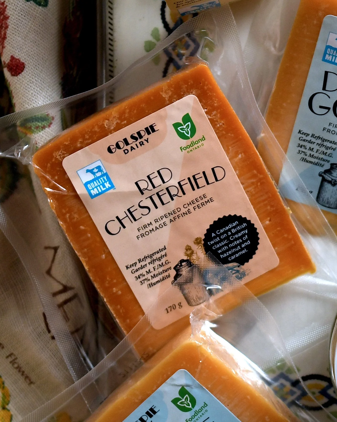
Scottish Cultural Cues: Drawing inspiration from Scotland's rich dairy heritage, we incorporated traditional symbols including the thistle, vintage milk can imagery, and rural countryside motifs that authentically represented British farming traditions.
Heritage Typography: We selected typefaces that aligned with the existing logo while evoking the quiet confidence of traditional British packaging—fonts that felt established, trustworthy, and unpretentious.
Warm Colour Palette: The colour system featured warm, earthy tones reminiscent of traditional British dairy packaging, accented with restrained navy touches. This palette communicated simplicity, trust, and the wholesome quality of dairy done well.
Intentional Authenticity
Cozy and Colloquial Tone: The packaging voice was deliberately unpolished—conversational, warm, and genuine. This approach rejected the overly refined aesthetic of premium brands in favor of honest, approachable communication.
Nostalgic Design Elements: Every visual choice reinforced the sense of familiar comfort—vintage milk cans, rural landscape references, and traditional British countryside aesthetics that trigger emotional connections.
Quiet Confidence: Rather than loud shelf presence, the packaging embodies the understated assurance of traditional British products—designs that don't need to shout because their quality speaks for itself.
Results & Cultural Connection
Instant Familiarity and Wholesome Appeal
The British-heritage dairy packaging successfully achieved its dual positioning goals:
Expatriate Connection: The authentic Scottish and British rural cues created immediate emotional resonance with customers experiencing homesickness or seeking familiar comfort foods from their heritage.
Universal Comfort Appeal: New customers without British connections responded to the wholesome, traditional aesthetic—the packaging communicated quality, trustworthiness, and the universal comfort of well-made dairy products.
Heritage Market Positioning: The packaging positioned the cheese within Ontario's rich British dairy-making tradition while distinguishing it from both mass-market and contemporary artisan brands.
Authentic vs. Manufactured Nostalgia: By embracing genuinely traditional design elements rather than trendy vintage aesthetics, the packaging achieved authentic heritage appeal that felt honest rather than contrived.
Key Insights for Heritage Food Packaging
Nostalgia Requires Authenticity: Successful heritage packaging must draw from genuine cultural traditions rather than superficial vintage styling. Customers seeking comfort foods respond to authentic historical references.
Unpolished Can Be Premium: Traditional heritage packaging often succeeds through restraint and simplicity rather than refined sophistication—the quiet confidence of established quality.
Cultural Bridge Building: Effective expatriate-focused packaging appeals to both cultural insiders seeking familiarity and mainstream consumers attracted to wholesome tradition.
Emotional Resonance Over Perfection: Intentionally unpolished, cozy packaging can create stronger emotional connections than slick, perfect designs—it feels human, honest, and comforting.
Conclusion
This British-heritage dairy packaging demonstrates how authentic cultural nostalgia can create powerful market positioning for food products. By embracing genuine Scottish and rural British design cues—thistles, vintage milk cans, heritage typography, and intentionally unpolished aesthetics—we created packaging that doesn't shout but feels instantly familiar to some and appealingly wholesome to all.
The project showcases the power of quiet confidence in packaging design: warm colours, restrained navy accents, cozy colloquial tone, and trust in simple authenticity. Rather than competing through loud shelf presence or trendy design, the packaging succeeds through the universal comfort of dairy done well, with just the right touch of homesickness for those who need it.
This approach honours Ontario's authentic British dairy-making heritage while creating packaging that resonates emotionally across diverse customer segments—proving that the most effective heritage packaging often comes from restraint, authenticity, and genuine cultural connection rather than manufactured nostalgia.