
Born from Expert Guidance, Built for Every Parent
When a mom and an allergist came together to solve a problem millions of parents face, Allermix was born. As new parents themselves, they knew firsthand the anxiety that comes with introducing common allergens to babies—the worry about reactions, the uncertainty about portions, the stress of doing it "right." With one parent being an allergist, they had expert guidance at home. But they quickly realized most parents don't have that luxury. They saw an opportunity to democratize access to safe, science-backed allergen introduction—and to do it right here in Canada.
CLIENT: ALLERMIX
BRANDING
PACKAGING
MARKETING
Canadian parents faced three key barriers: expensive imported products with added shipping costs, confusion about when to introduce versus maintain allergen exposure, and a lack of Canadian-made options they could trust. The founders needed packaging that could educate anxious parents, differentiate between introduction and maintenance phases, and position Allermix as an accessible, trustworthy Canadian alternative—all while communicating the science-backed approach behind their formulations.
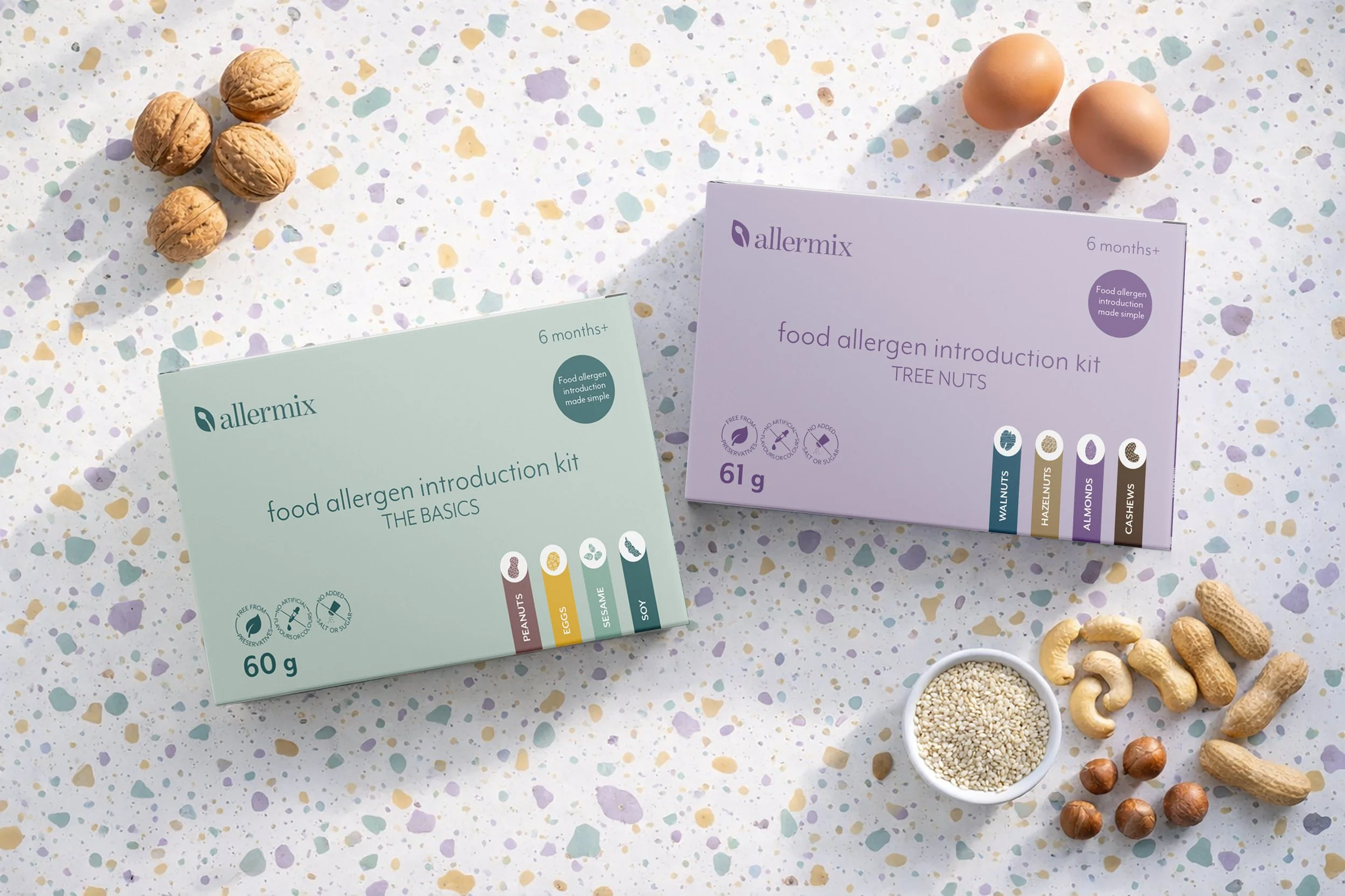
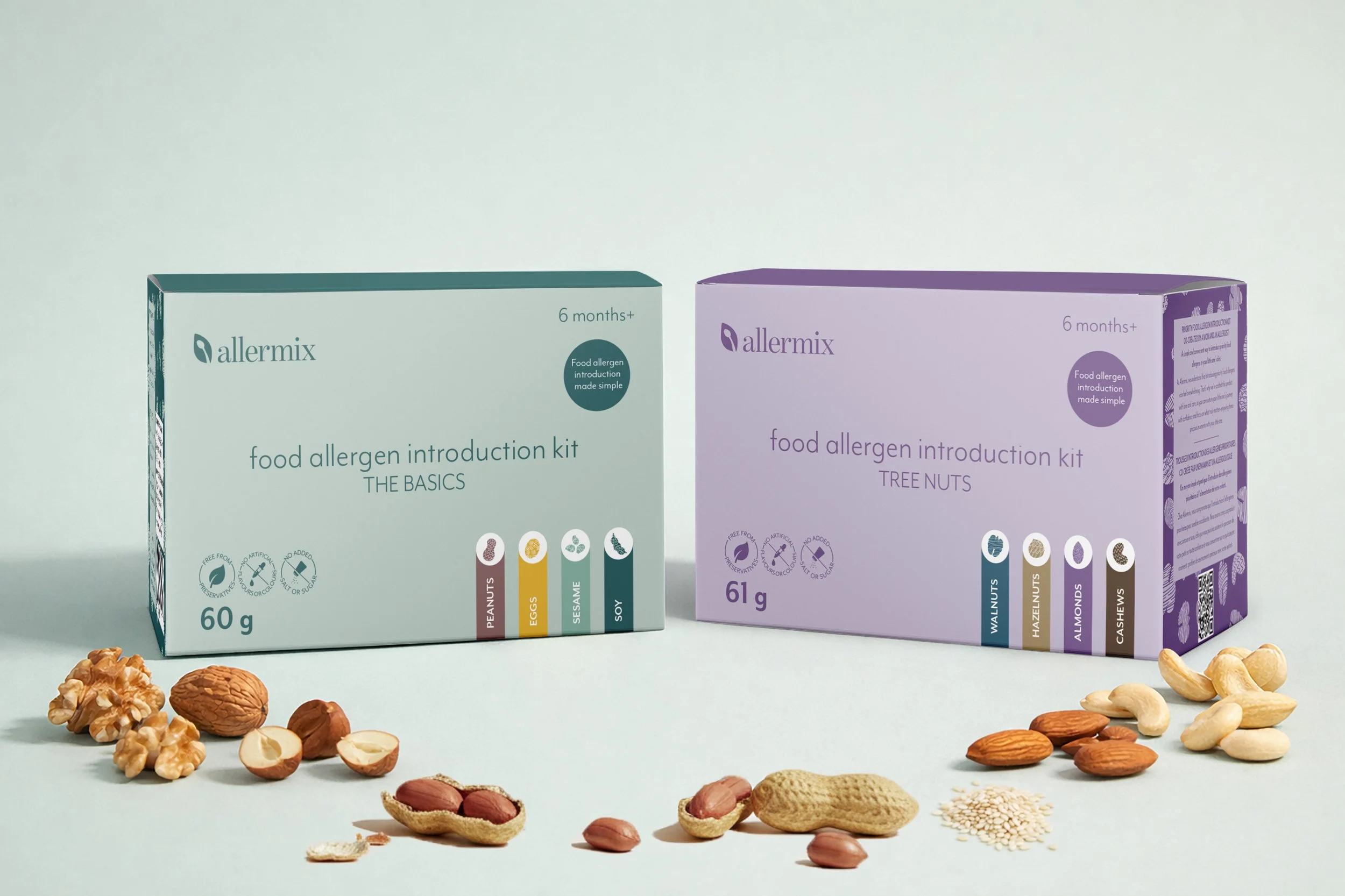
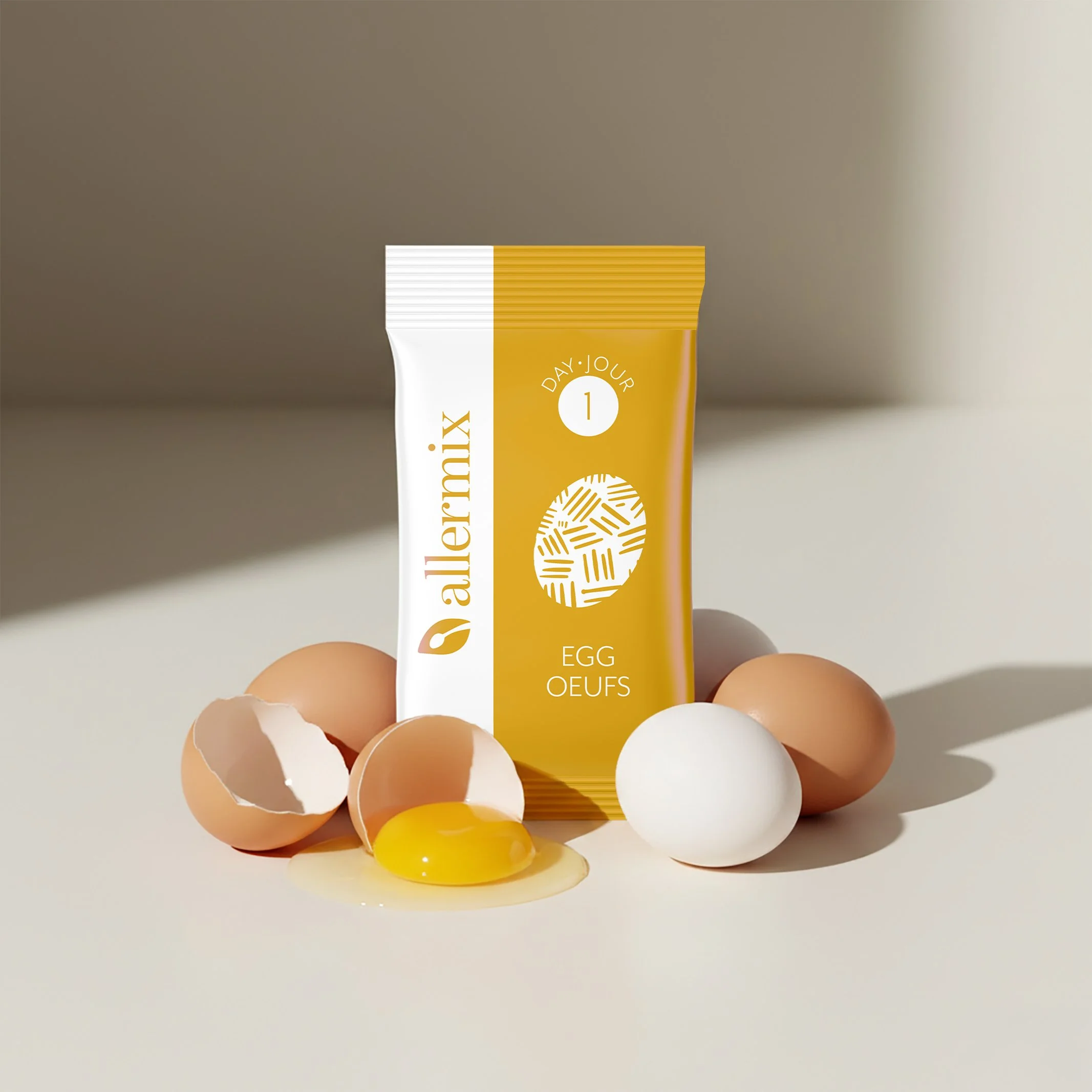
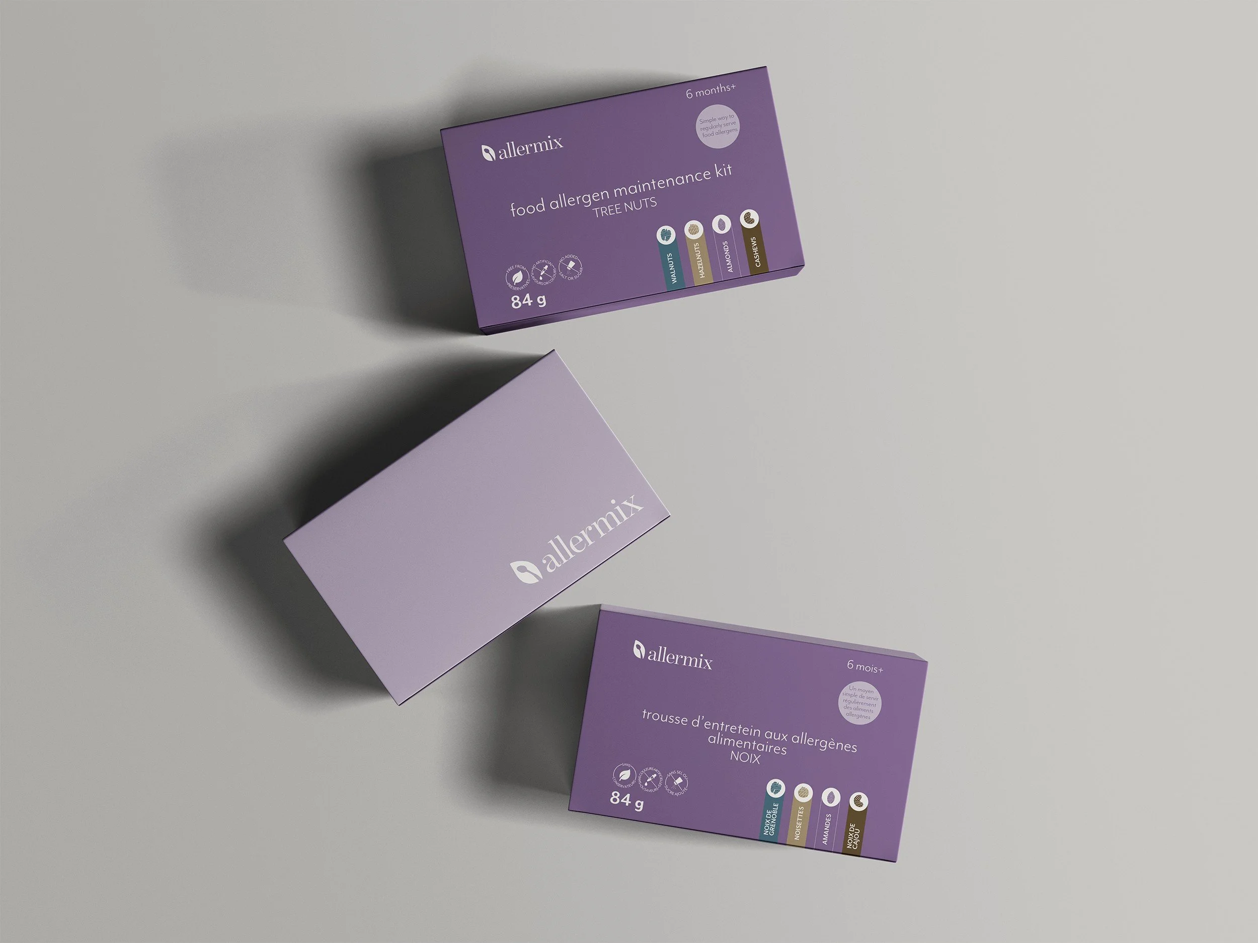
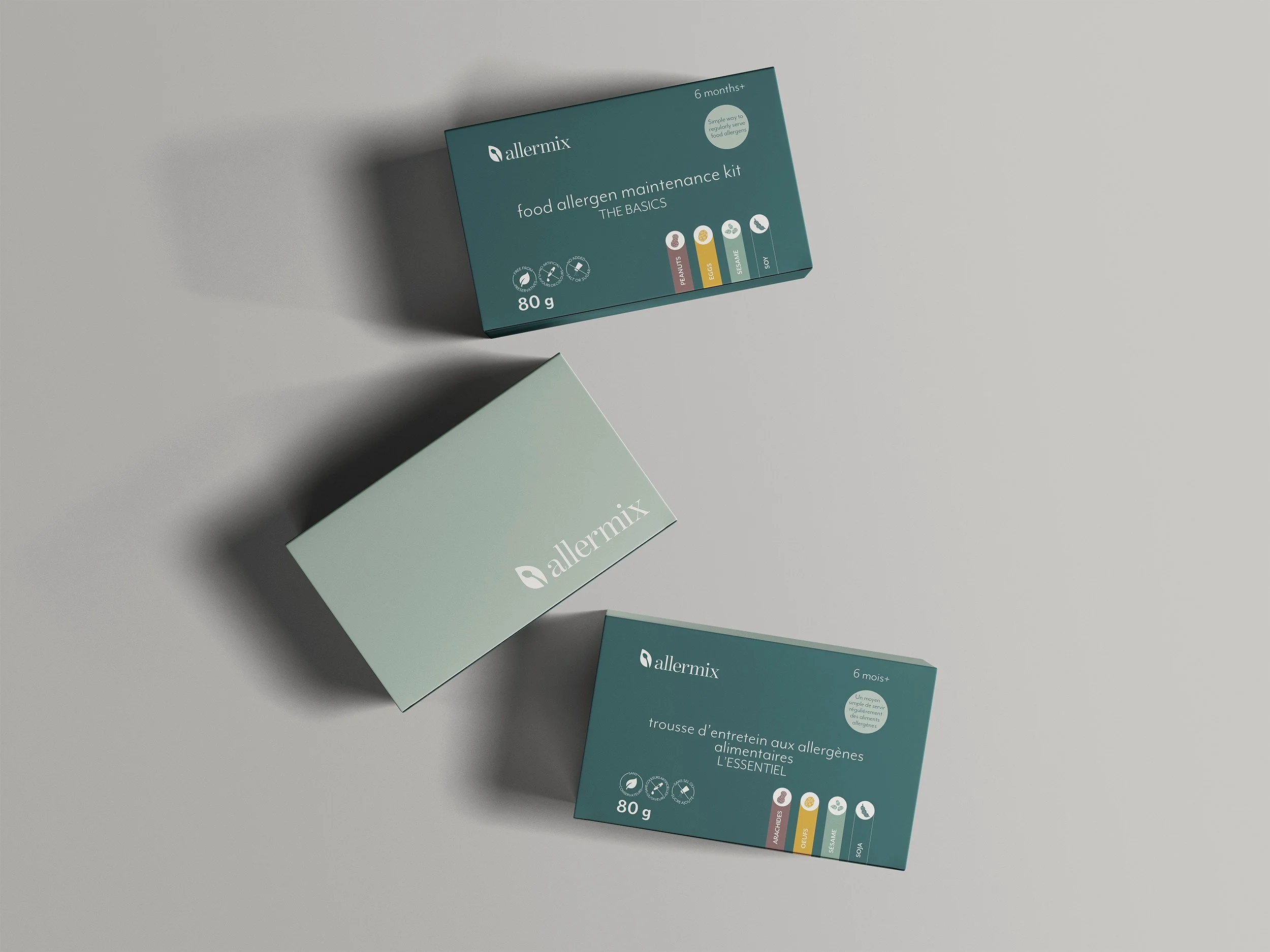
We developed a dual-colour packaging system that instantly communicates product purpose. The "Introduction Kits" signal the start of the journey with graduated portions that build confidence, while the "Maintenance Kits" clearly indicate the next phase, keeping allergens in baby's routine after successful introduction. This colour-coding eliminates confusion at retail and helps parents navigate the category with clarity.
The clean, modern design aesthetic speaks to the product's purity, no additives, just pure whole foods in ultra-fine powder form. We balanced approachability with clinical credibility through typography that feels both friendly and authoritative. Each package clearly communicates the allergens inside, the organic and free-run sourcing, and the Canadian-made positioning. The result is packaging that reduces parental anxiety while commanding premium shelf space.
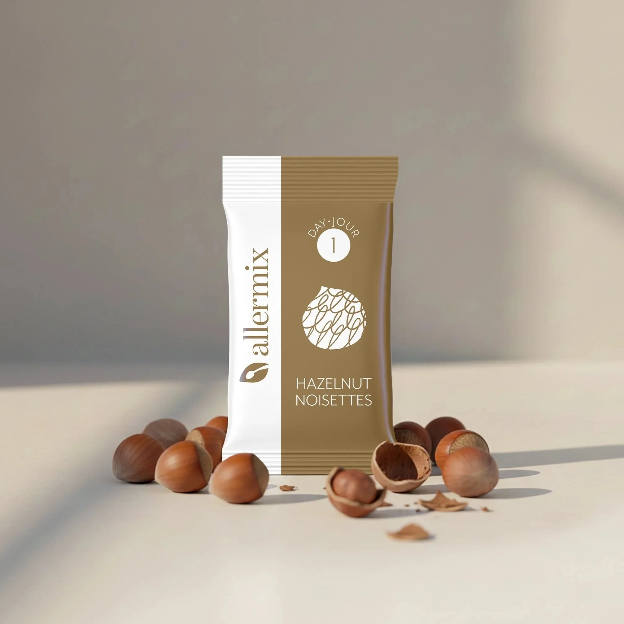
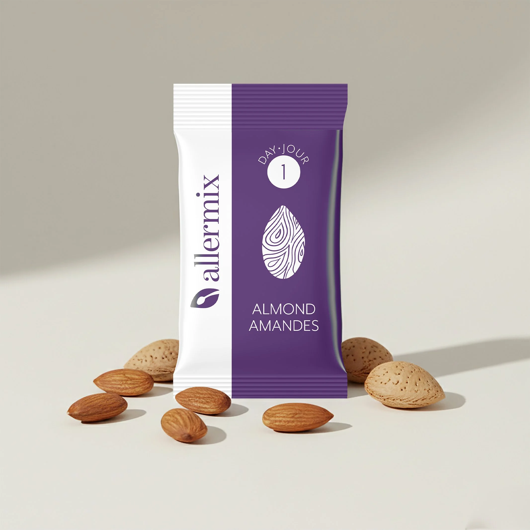
Allermix launched with a complete product line spanning introduction kits, maintenance kits, and individual allergen powder pouches, covering both "The Basics" (peanut, egg, sesame, soy) and "Tree Nuts" (walnut, hazelnut, almond, cashew). The packaging system successfully positions Allermix as Canada's accessible answer to allergen introduction, competitively priced, locally made, and backed by an allergist's expertise.
For Canadian families navigating the critical early months of allergen introduction, Allermix packaging signals both accessibility and authority, making science-backed allergy prevention feel achievable for every family.
Project Scope:
Complete packaging design system for introduction and maintenance kits
Dual-colour coding strategy for product differentiation
Individual allergen powder packaging across 8 allergens
Bilingual labelling (English/French) for Canadian market
Nutritional panel design and regulatory compliance
Brand positioning for health-conscious Canadian parents